Unlock a world of possibilities! Login now and discover the exclusive benefits awaiting you.

- Qlik Community
- :
- All Forums
- :
- QlikView
- :
- Pie Chart Coloring
- Subscribe to RSS Feed
- Mark Topic as New
- Mark Topic as Read
- Float this Topic for Current User
- Bookmark
- Subscribe
- Mute
- Printer Friendly Page

- Mark as New
- Bookmark
- Subscribe
- Mute
- Subscribe to RSS Feed
- Permalink
- Report Inappropriate Content
Pie Chart Coloring
Hi All,
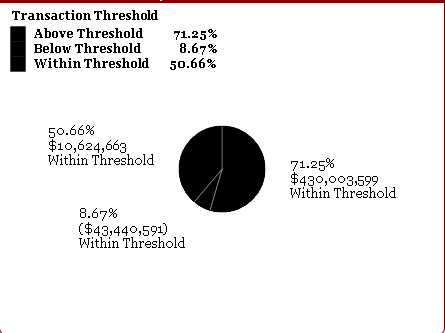
This is a snapshot of the pie chart I created. For some reason, each of the parts say 'within threshold' when I wrote the code:
=IF($(vfield) < $(vMinThresholdAmount), 'Below Threshold',IF($(vfield) > $(vMaxThresholdAmount), 'Above Threshold','Within Threshold'))
as the dimension.
Also, I cannot get the colors to apply for each part. For each expressions background color, I put the following code:
=IF(Match(Table,'Above Threshold'),v_Red_100,IF(Match(Table,'Below Threshold'),v_Rose_100,IF(Match(Table,'Within Threshold'),v_Tangerine_100)))
The variables are in my code and work for other charts so I know that is not the problem. Could someone assist?
Thanks!

 swuehl
- Mark as New
- Bookmark
- Subscribe
- Mute
- Subscribe to RSS Feed
- Permalink
- Report Inappropriate Content
I think you are using an expression to create the labels next to the sectors (or multiple expressions?)
How do these look like?
With regard to your color issue,
=IF(Match(Table,'Above Threshold'),v_Red_100,IF(Match(Table,'Below Threshold'),v_Rose_100,IF(Match(Table,'Within Threshold'),v_Tangerine_100)))
Where does the Table field here comes from?
- Mark as New
- Bookmark
- Subscribe
- Mute
- Subscribe to RSS Feed
- Permalink
- Report Inappropriate Content
Thanks very much for your reply, however this did not work.
Table is a field that I am using as a filter.

 sunny_talwar
- Mark as New
- Bookmark
- Subscribe
- Mute
- Subscribe to RSS Feed
- Permalink
- Report Inappropriate Content
Would you be able to share a sample to look at the issue?