Unlock a world of possibilities! Login now and discover the exclusive benefits awaiting you.

- Qlik Community
- :
- All Forums
- :
- QlikView
- :
- Plotting consecutive sum values in chart
- Subscribe to RSS Feed
- Mark Topic as New
- Mark Topic as Read
- Float this Topic for Current User
- Bookmark
- Subscribe
- Mute
- Printer Friendly Page

- Mark as New
- Bookmark
- Subscribe
- Mute
- Subscribe to RSS Feed
- Permalink
- Report Inappropriate Content
Plotting consecutive sum values in chart
| Category | Date | Value |
|---|---|---|
| A | 01-Oct-2016 | 2 |
| A | 02-Oct-2016 | 3 |
| A | 03-Oct-2016 | 1 |
| A | 04-Oct-2016 | 5 |
| A | 05-Oct-2016 | 4 |
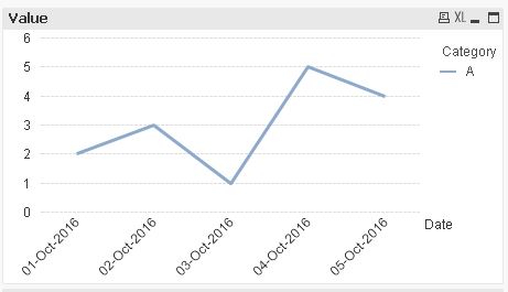
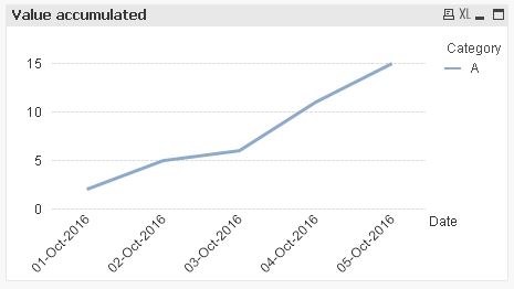
The above sample data should be plotted in a Line Chart in way values sum up for each day. More like a Fibonacci series.
This should be my resultant table data
| Category | Date | Value | NewValue |
|---|---|---|---|
| A | 01-Oct-2016 | 2 | 2 |
| A | 02-Oct-2016 | 3 | 5 |
| A | 03-Oct-2016 | 1 | 6 |
| A | 04-Oct-2016 | 5 | 11 |
| A | 05-Oct-2016 | 4 | 15 |
Is there a way to do this? Solutions for both at the script level or front end level (Using Expressions) would do the need.

 lakshmikandh
- Mark as New
- Bookmark
- Subscribe
- Mute
- Subscribe to RSS Feed
- Permalink
- Report Inappropriate Content
Check this thread Cumulative sum depends on dimension values | Qlik Community

- Mark as New
- Bookmark
- Subscribe
- Mute
- Subscribe to RSS Feed
- Permalink
- Report Inappropriate Content
Perhaps this
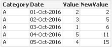
Using Straight Table
Take Dimension --> Category, Date
Expressions are
1) Sum(Value)
2) Rangesum(Below(Sum(Value),0),Above(Value,1,4))
And Second Expression, If you have more Category, Dates then for safety you can give Value like below
Rangesum(Below(Sum(Value),0),Above(Value,1,1000))
For Ref, PFA

 sunny_talwar
- Mark as New
- Bookmark
- Subscribe
- Mute
- Subscribe to RSS Feed
- Permalink
- Report Inappropriate Content
How long does accumulation restarts at the end of the month of end of the year? I am guessing it does restart for each category, right?
 MarcoWedel
- Mark as New
- Bookmark
- Subscribe
- Mute
- Subscribe to RSS Feed
- Permalink
- Report Inappropriate Content
Hi,
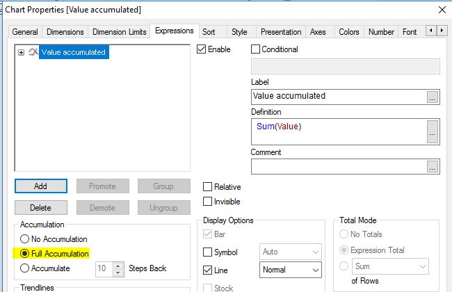
one front end solution could be the chart-in-built accumulation option:
hope this helps
regards
Marco