Unlock a world of possibilities! Login now and discover the exclusive benefits awaiting you.

- Qlik Community
- :
- All Forums
- :
- QlikView
- :
- Possible to create a dot chart
- Subscribe to RSS Feed
- Mark Topic as New
- Mark Topic as Read
- Float this Topic for Current User
- Bookmark
- Subscribe
- Mute
- Printer Friendly Page

- Mark as New
- Bookmark
- Subscribe
- Mute
- Subscribe to RSS Feed
- Permalink
- Report Inappropriate Content
Possible to create a dot chart
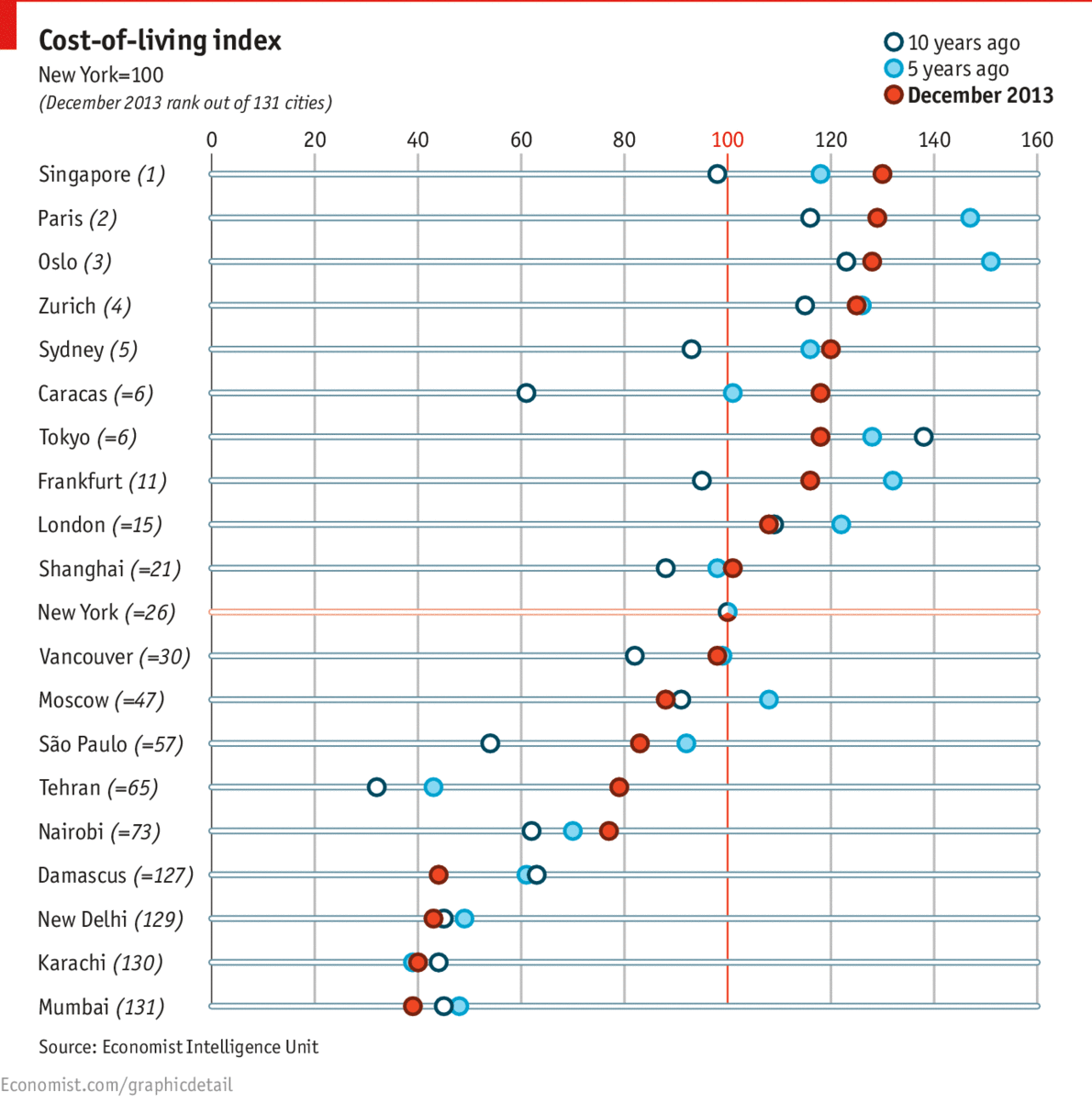
Is it possible to create similar chart in QlikView.
Thought I could do a combined bar and line chart, remove the line and add a symbol but the lines keep getting displayed.
Accepted Solutions
- Mark as New
- Bookmark
- Subscribe
- Mute
- Subscribe to RSS Feed
- Permalink
- Report Inappropriate Content
The simplest thing to do would be to create a line chart but use symbols instead of lines. Also, show the grid on the dimension axis to give a visual cue to users to tie dimensions to values.

 its_anandrjs
- Mark as New
- Bookmark
- Subscribe
- Mute
- Subscribe to RSS Feed
- Permalink
- Report Inappropriate Content
You can create a scatter or Grid chart which is giving same presentation to you. Refer a sample application in Qlikview Examples.
Hope this helps
Thanks & Regards
- Mark as New
- Bookmark
- Subscribe
- Mute
- Subscribe to RSS Feed
- Permalink
- Report Inappropriate Content
When I change the dimension from a large one (+300) to a small one (+30) it works as expected?
its_anandrjs
- Mark as New
- Bookmark
- Subscribe
- Mute
- Subscribe to RSS Feed
- Permalink
- Report Inappropriate Content
Check the dimension values and use like Trim(DimensionField) and try to use like that i believe it will ok.
Thanks & Regards
- Mark as New
- Bookmark
- Subscribe
- Mute
- Subscribe to RSS Feed
- Permalink
- Report Inappropriate Content
The simplest thing to do would be to create a line chart but use symbols instead of lines. Also, show the grid on the dimension axis to give a visual cue to users to tie dimensions to values.