Unlock a world of possibilities! Login now and discover the exclusive benefits awaiting you.
- Qlik Community
- :
- All Forums
- :
- QlikView
- :
- QlikView Horizontal Gauge Chart - Leading Lines
- Subscribe to RSS Feed
- Mark Topic as New
- Mark Topic as Read
- Float this Topic for Current User
- Bookmark
- Subscribe
- Mute
- Printer Friendly Page
- Mark as New
- Bookmark
- Subscribe
- Mute
- Subscribe to RSS Feed
- Permalink
- Report Inappropriate Content
QlikView Horizontal Gauge Chart - Leading Lines
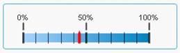
When I create a horizontal gauge in Qlikview and select scale the chart is presented with the correct figures, but with large unnecessary leading lines. How can I get rid of these? Image attached below:
- Tags:
- new_to_qlikview
- Mark as New
- Bookmark
- Subscribe
- Mute
- Subscribe to RSS Feed
- Permalink
- Report Inappropriate Content
This is a discussion group for Sense perhaps moving it to View will get you more responses.
Based on your question and your screen shot I'm failing to see your issue as it looks perfectly understandable to me. Maybe i'm missing something.
- Mark as New
- Bookmark
- Subscribe
- Mute
- Subscribe to RSS Feed
- Permalink
- Report Inappropriate Content
There is only a very limited amount of space in the final app. I agree it does look presentable when shown on it's own, but when used in the context of a larger/busier application I really need it to be presented without the leading lines between the bar and the scale figures.
Any suggestions?
- Mark as New
- Bookmark
- Subscribe
- Mute
- Subscribe to RSS Feed
- Permalink
- Report Inappropriate Content
try tis,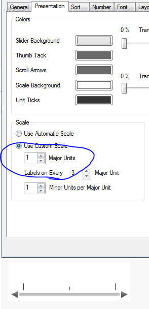
- Mark as New
- Bookmark
- Subscribe
- Mute
- Subscribe to RSS Feed
- Permalink
- Report Inappropriate Content
you will need to adjust the major and minor scales on the Presentation tab
- Mark as New
- Bookmark
- Subscribe
- Mute
- Subscribe to RSS Feed
- Permalink
- Report Inappropriate Content
I've tried this. Ideally I'd want the figures to appear and not the leader lines as you have shown in your gauge above.
Also, I'm intrigued by your screen shot. The sequence of your tabs and layout of your sheet appear quite different to what I can see. What version are you using?
- Mark as New
- Bookmark
- Subscribe
- Mute
- Subscribe to RSS Feed
- Permalink
- Report Inappropriate Content
qv 11.20