Unlock a world of possibilities! Login now and discover the exclusive benefits awaiting you.

Announcements
Talend Cloud AWS EU Scheduled Outage: Starting Tues 26 May 21:00 CEST with expected completion Wed 27 May 01:00 CEST
- Qlik Community
- :
- All Forums
- :
- QlikView
- :
- Scatter / Bubble chart over time
Options
- Subscribe to RSS Feed
- Mark Topic as New
- Mark Topic as Read
- Float this Topic for Current User
- Bookmark
- Subscribe
- Mute
- Printer Friendly Page
Turn on suggestions
Auto-suggest helps you quickly narrow down your search results by suggesting possible matches as you type.
Showing results for

 brf10043
Creator
2017-04-21
01:33 PM
- Mark as New
- Bookmark
- Subscribe
- Mute
- Subscribe to RSS Feed
- Permalink
- Report Inappropriate Content
Scatter / Bubble chart over time
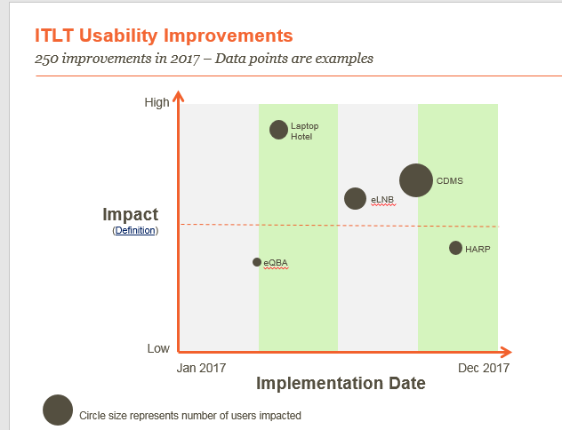
Team, Is there anyway in Qlikview to produce the chart below?
- Impact is Lomw, Medium or High (Text)
- Implementation date is the timestamp (Date)
- The bubble size is the number of people impacted (number)
This chart has an overlay that represents the 4 quarters. I don't really need that functionality.
640 Views
1 Reply
brf10043
Creator
2017-04-21
01:35 PM
Author
- Mark as New
- Bookmark
- Subscribe
- Mute
- Subscribe to RSS Feed
- Permalink
- Report Inappropriate Content
I've been able to produce the chart below, but when I select Month or Quarter in the cyclic menu, the two April dots get combined into a single dot.

541 Views
