Unlock a world of possibilities! Login now and discover the exclusive benefits awaiting you.

- Qlik Community
- :
- All Forums
- :
- QlikView
- :
- Specific Axes
- Subscribe to RSS Feed
- Mark Topic as New
- Mark Topic as Read
- Float this Topic for Current User
- Bookmark
- Subscribe
- Mute
- Printer Friendly Page

- Mark as New
- Bookmark
- Subscribe
- Mute
- Subscribe to RSS Feed
- Permalink
- Report Inappropriate Content
Specific Axes
Hello,
I was wondering if anyone can help me with a design issue i'm facing.
I currently have a graph that repsent a %. Here is an example.
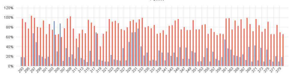
The numbers (293 - 379) are the trip number. This graph includes all dates.
I currently need to put a visual cue or something that would let me identify from different years.
Here is an rough example of what i would wish to have.
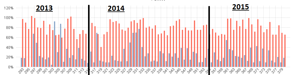
Does anyone knows how i can do this??
When I try to use Year as a dimension, this is the result.
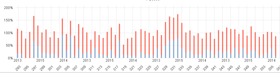
As you can see, it stacks the graph, and i needed grouped. Also the Years are Wrong, even tho the year is a field on the same database.
Any ideas??
thanks,
KR

 MarcoWedel
- Mark as New
- Bookmark
- Subscribe
- Mute
- Subscribe to RSS Feed
- Permalink
- Report Inappropriate Content
Hi,
maybe using reference lines and text in chart?
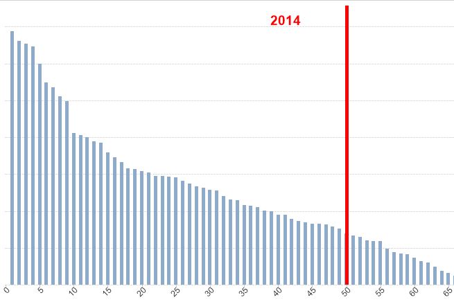
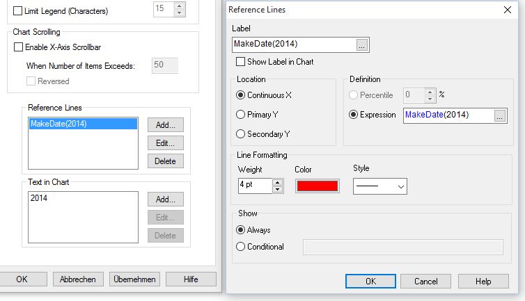
hope this helps
regards
Marco
 rwunderlich
- Mark as New
- Bookmark
- Subscribe
- Mute
- Subscribe to RSS Feed
- Permalink
- Report Inappropriate Content
The approach I take is to add an extra expression (but promote it to first)
=if(Year <> above(Year), Year, '')
That will draw a bar in January of each year. Check "Values on Data Points". Put the expression on the right axis and hide the axis. You'll get something that looks like this:
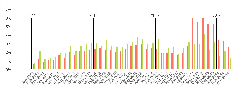
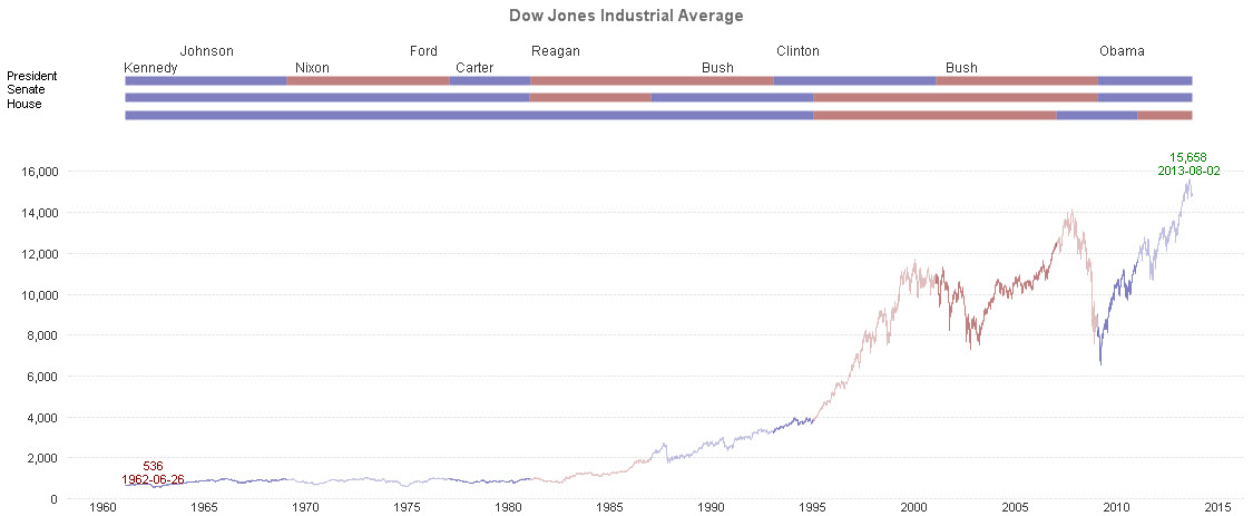
You can get very fancy by positioning the label in the middle, using horizontal lines (Combo chart) instead of bars, bar offsets, arrows. For example, below is a single combo chart. You can see the details of creating it in this tutorial:
Qlikview Cookbook: Tutorial - Continuous Axis And Multiple Scales http://qlikviewcookbook.com/recipes/download-info/tutorial-continuous-axis-and-multiple-scales/
-Rob