Unlock a world of possibilities! Login now and discover the exclusive benefits awaiting you.
- Qlik Community
- :
- All Forums
- :
- QlikView
- :
- Stacked Bar Chart broken down into %'s
- Subscribe to RSS Feed
- Mark Topic as New
- Mark Topic as Read
- Float this Topic for Current User
- Bookmark
- Subscribe
- Mute
- Printer Friendly Page
- Mark as New
- Bookmark
- Subscribe
- Mute
- Subscribe to RSS Feed
- Permalink
- Report Inappropriate Content
Stacked Bar Chart broken down into %'s
Hi,
I'm trying to achieve a challenging task with the QlikView staced bar chart..
I have two dimensions: Region and Functional Area. I am trying to find out the utilization % for each functional area within a Region. Please look at the below screenshot.
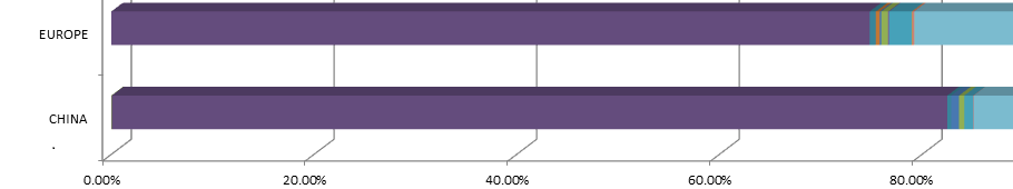
In the above image, the %'s represent the Utilization Rate, where the different colors are functional areas within that region (Europe or China in this case).
Please keep in mind that the Utilization Rates do not add up to 100% for any of the regions, they should not.
As you can clearly see here,
I can complete the first part of my task and display the Utilization Rates per each region without those broken down into functional areas, as you can see below.
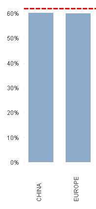
*Please note that I changed the Utilization %'s for the 2nd image for privacy purposes.
In order to get to the above chart, I'm using Region as a dimension and doing calculations in the expression for the Utilization Rate. Ideally, when I use the Functional Area for the 2nd dimension, it should work. But in my case, it unfortunately does NOT work. The resulting chart has %'s adding up to more than 1000% for some regions.
Do I have to change my calculation for the expression when I add the 2nd dimension? If not, what am I doing wrong?
Any help will be greatly appreciated.
Thanks,
-K
- Mark as New
- Bookmark
- Subscribe
- Mute
- Subscribe to RSS Feed
- Permalink
- Report Inappropriate Content
Hi,
Try with this:
Sum(Value) / Sum(TOTAL <Region> Value)
Regards,
Ricardo
- Mark as New
- Bookmark
- Subscribe
- Mute
- Subscribe to RSS Feed
- Permalink
- Report Inappropriate Content
upload your sample application i will do your need.