Unlock a world of possibilities! Login now and discover the exclusive benefits awaiting you.
- Qlik Community
- :
- All Forums
- :
- QlikView
- :
- Stacked bar chart
- Subscribe to RSS Feed
- Mark Topic as New
- Mark Topic as Read
- Float this Topic for Current User
- Bookmark
- Subscribe
- Mute
- Printer Friendly Page
- Mark as New
- Bookmark
- Subscribe
- Mute
- Subscribe to RSS Feed
- Permalink
- Report Inappropriate Content
Stacked bar chart
I'm struggling to show a data on a stacked bars chart, I have the data in the follwoing format:
| Id | Location | Sector1 Risk Level | Sector2 Risk Level | Sector3 Risk Level |
|---|---|---|---|---|
| 1 | Location1 | High | Low | Low |
| 2 | Location2 | Low | Low | Low |
| 3 | Location3 | Low | Medium | Low |
| 4 | Location4 | Low | Medium | High |
| 5 | Location5 | Medium | Medium | High |
| 6 | Location6 | Medium | Medium | High |
| 7 | Location7 | Low | High | Medium |
| 8 | Location8 | High | Low | Medium |
What would be the best way to show the data on stacked bars so that X-axis has: 'Sector1 Risk Level', 'Sector2 Risk Level' and 'Sector3 Risk Level' dimensions, then the risk levels count will be displayed on stacked bars per each sector?
Thanks.
Accepted Solutions
- Mark as New
- Bookmark
- Subscribe
- Mute
- Subscribe to RSS Feed
- Permalink
- Report Inappropriate Content
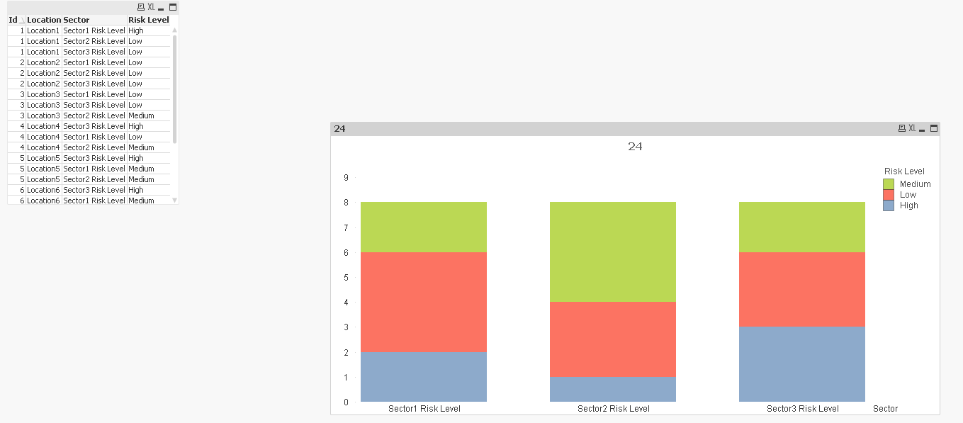
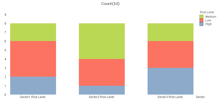
Used a The Crosstable Load to transform the data and then used this
Dimensions
Sector
Risk Level
Expression
Count(Id)
- Mark as New
- Bookmark
- Subscribe
- Mute
- Subscribe to RSS Feed
- Permalink
- Report Inappropriate Content
Used a The Crosstable Load to transform the data and then used this
Dimensions
Sector
Risk Level
Expression
Count(Id)
- Mark as New
- Bookmark
- Subscribe
- Mute
- Subscribe to RSS Feed
- Permalink
- Report Inappropriate Content
Hi,
You can try:
CrossTable(Sector, [Risk Level], 2)
LOAD Id,
     Location,
     [Sector1 Risk Level],
     [Sector2 Risk Level],
     [Sector3 Risk Level]
FROM
[https://community.qlik.com/thread/252587]
(html, codepage is 1252, embedded labels, table is @1);
- Mark as New
- Bookmark
- Subscribe
- Mute
- Subscribe to RSS Feed
- Permalink
- Report Inappropriate Content
stalwar1, you are faster than light ^^
- Mark as New
- Bookmark
- Subscribe
- Mute
- Subscribe to RSS Feed
- Permalink
- Report Inappropriate Content
Works great! Thanks Talwar and Martinez for your very fast help..