Unlock a world of possibilities! Login now and discover the exclusive benefits awaiting you.

- Qlik Community
- :
- All Forums
- :
- QlikView
- :
- Strange Area Chart behaviour
- Subscribe to RSS Feed
- Mark Topic as New
- Mark Topic as Read
- Float this Topic for Current User
- Bookmark
- Subscribe
- Mute
- Printer Friendly Page
 juleshartley
- Mark as New
- Bookmark
- Subscribe
- Mute
- Subscribe to RSS Feed
- Permalink
- Report Inappropriate Content
Strange Area Chart behaviour
Hi All,
Can anyone explain this behaviour to me?
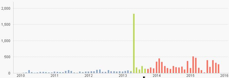
I have a simple chart with no conditions on colour etc. but with a 'continuous' x axis. When viewing the it as a stacked bar chart it looks like this, which is as I would expect:
But when I switch to an area chart it looks like this:
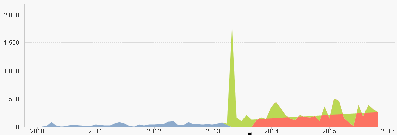
With the strange green area in for 2014 onwards...
Does anyone know why this is happening?
Thanks!
- Tags:
- area chart
Accepted Solutions

 swuehl
- Mark as New
- Bookmark
- Subscribe
- Mute
- Subscribe to RSS Feed
- Permalink
- Report Inappropriate Content

 manojkulkarni
- Mark as New
- Bookmark
- Subscribe
- Mute
- Subscribe to RSS Feed
- Permalink
- Report Inappropriate Content
can you post your application ?
 rbecher
- Mark as New
- Bookmark
- Subscribe
- Mute
- Subscribe to RSS Feed
- Permalink
- Report Inappropriate Content
Hi Julian,
can you upload an example with the data?
- Ralf

- Mark as New
- Bookmark
- Subscribe
- Mute
- Subscribe to RSS Feed
- Permalink
- Report Inappropriate Content
On the Colors tab is Persistent Colors ticked ?
juleshartley
- Mark as New
- Bookmark
- Subscribe
- Mute
- Subscribe to RSS Feed
- Permalink
- Report Inappropriate Content
I'm afraid it's difficult to post an application with data... I'll see what I can do.
It is not to do with persistent colours.
swuehl
- Mark as New
- Bookmark
- Subscribe
- Mute
- Subscribe to RSS Feed
- Permalink
- Report Inappropriate Content
Looks like a reported bug to me:
Re: Line chart (stacked area's as Style) - empty (no-data) area is filled up