Unlock a world of possibilities! Login now and discover the exclusive benefits awaiting you.
- Qlik Community
- :
- All Forums
- :
- QlikView
- :
- Tacometro
- Subscribe to RSS Feed
- Mark Topic as New
- Mark Topic as Read
- Float this Topic for Current User
- Bookmark
- Subscribe
- Mute
- Printer Friendly Page
- Mark as New
- Bookmark
- Subscribe
- Mute
- Subscribe to RSS Feed
- Permalink
- Report Inappropriate Content
Tacometro
hi,
i have the following data:
| SITIO | CAPACIDAD TANQUE GL | SUMINISTRADO |
|---|---|---|
| BOGOTA | 500 | 400 |
| CALI | 700 | 600 |
| MEDELLIN | 600 | 550 |
| BUCARAMANGA | 800 | 400 |
i wanna plot the following:
i want used this chart

i need show the capacity free
example:
bogota: 400/500= 80%
i wanna that this value to be indicated
this is posible?
thank you
sorry my english
- Mark as New
- Bookmark
- Subscribe
- Mute
- Subscribe to RSS Feed
- Permalink
- Report Inappropriate Content
If you want to make a gauge specifically for BOGOTA you could use an expression like:
sum({$<SITIO={'BOGOTA'}>} SUMINISTRADO/[CAPACIDAD TANQUE GL])
- Mark as New
- Bookmark
- Subscribe
- Mute
- Subscribe to RSS Feed
- Permalink
- Report Inappropriate Content
Hi,
In the requirement your data has 4 SITIO. The gauge(tacho) chart can display only on of them at one time. Hence you will have to slect the particular SITIO.
Else you could display all the SITIO side by side, like a clusture of charts like this
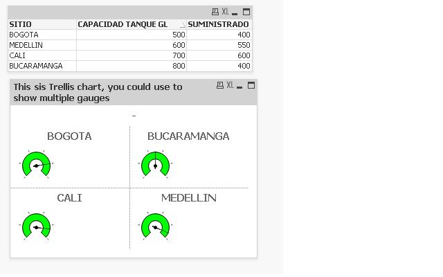
.. For this you will have to use Trellis option at the bottom in the Dimensions tab of the Chart properties.
You will be able to define the color in the presentation tab.
Attached is an sample qvw.
Hope this helps.
Thanks
SITIOSITIO
- Mark as New
- Bookmark
- Subscribe
- Mute
- Subscribe to RSS Feed
- Permalink
- Report Inappropriate Content
- Mark as New
- Bookmark
- Subscribe
- Mute
- Subscribe to RSS Feed
- Permalink
- Report Inappropriate Content
Hi,
The expressiong is the same "=SUMINISTRADO/[CAPACIDAD TANQUE GL]"
It is in the qvw attached in the previous reply.
Thanks