Unlock a world of possibilities! Login now and discover the exclusive benefits awaiting you.

- Qlik Community
- :
- All Forums
- :
- QlikView
- :
- Re: Types of visualization
- Subscribe to RSS Feed
- Mark Topic as New
- Mark Topic as Read
- Float this Topic for Current User
- Bookmark
- Subscribe
- Mute
- Printer Friendly Page

- Mark as New
- Bookmark
- Subscribe
- Mute
- Subscribe to RSS Feed
- Permalink
- Report Inappropriate Content
Types of visualization
Hi,
I would like to know hor to get a visualizacion of a expresion like the two ones under the title 'sales trends 2008 - 2009'

Thanks in advance
- Tags:
- new_to_qlikview

 jpapador
- Mark as New
- Bookmark
- Subscribe
- Mute
- Subscribe to RSS Feed
- Permalink
- Report Inappropriate Content
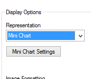
In the properties of that object, on the expression tab. Choose the expression you want to change and there is a drop down box called representation. Change it to mini chart and you can change the settings by clicking the minichart setting button.

 maxgro
- Mark as New
- Bookmark
- Subscribe
- Mute
- Subscribe to RSS Feed
- Permalink
- Report Inappropriate Content
Regional Scorecard is a straight table chart
Sales trend is a minichart, the expression is
Sum({$<Year={$(=Max(Year)), $(=Max(Year)-1)}>} Sales/$(vCurrency))
and then there is an additional dimension MonthYear
In your QikView installation folder there is a Qlik document, Data Visualization.qvw, the tab Sparklines has the chart in your image