Unlock a world of possibilities! Login now and discover the exclusive benefits awaiting you.

- Qlik Community
- :
- All Forums
- :
- QlikView
- :
- bubble chart graph
Options
- Subscribe to RSS Feed
- Mark Topic as New
- Mark Topic as Read
- Float this Topic for Current User
- Bookmark
- Subscribe
- Mute
- Printer Friendly Page
Turn on suggestions
Auto-suggest helps you quickly narrow down your search results by suggesting possible matches as you type.
Showing results for

 Shinigaloo
Contributor III
2021-03-19
11:31 AM
- Mark as New
- Bookmark
- Subscribe
- Mute
- Subscribe to RSS Feed
- Permalink
- Report Inappropriate Content
bubble chart graph
Hello everyone,
i have this bubble chart graph , i want to have the abscissa in this way

instead of this

1,464 Views
3 Replies

 rubenmarin
MVP
2021-03-19
11:38 AM
- Mark as New
- Bookmark
- Subscribe
- Mute
- Subscribe to RSS Feed
- Permalink
- Report Inappropriate Content
Hi, if you change it to a bar chart, there is an option in the axis tab to show dimension labels in diagonal
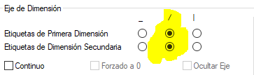
Select this, apply and the return to set as bubble chart, the axis values will remain diagonal.
Shinigaloo
Contributor III
2021-03-23
11:58 AM
Author
- Mark as New
- Bookmark
- Subscribe
- Mute
- Subscribe to RSS Feed
- Permalink
- Report Inappropriate Content
thank you Ruben , It's works 🙂
1,421 Views

 johnca
Specialist
2021-05-21
10:55 AM
- Mark as New
- Bookmark
- Subscribe
- Mute
- Subscribe to RSS Feed
- Permalink
- Report Inappropriate Content
Shinigaloo, please mark Ruben's reply as the correct answer so that folks like me don't waste time looking at solved questions. Thanks.
1,355 Views
