Unlock a world of possibilities! Login now and discover the exclusive benefits awaiting you.
- Qlik Community
- :
- All Forums
- :
- QlikView
- :
- co occurrence chart
- Subscribe to RSS Feed
- Mark Topic as New
- Mark Topic as Read
- Float this Topic for Current User
- Bookmark
- Subscribe
- Mute
- Printer Friendly Page
- Mark as New
- Bookmark
- Subscribe
- Mute
- Subscribe to RSS Feed
- Permalink
- Report Inappropriate Content
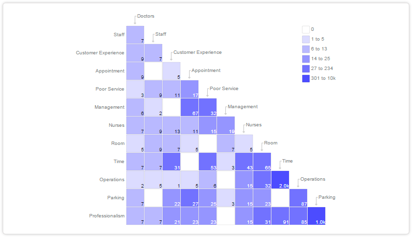
co occurrence chart
Hi,
anyone who tried to build an co occurrence Chart with qlikview?
I think I would try it with an Pivot table?
But how should I structure the data? Are the any functions in qlikview to make it easy?
Thanks in Advance
- Mark as New
- Bookmark
- Subscribe
- Mute
- Subscribe to RSS Feed
- Permalink
- Report Inappropriate Content
Easy - not really. Beside using a pivot in a heat-map style which is the easiest approach you could also try it with a stacked bar-chart - whereby I would probably try to use both approaches and laying them over eachother.
The pivot with some layout-options like transparent horizontal header and so on and the color-logig would be applied within the attribut-expressions. The bar-chart would be used to display the right text-parts with the arrow.
- Marcus