Unlock a world of possibilities! Login now and discover the exclusive benefits awaiting you.

- Qlik Community
- :
- Forums
- :
- Analytics & AI
- :
- Products & Topics
- :
- Visualization and Usability
- :
- Convert bar chart to pivot table
- Subscribe to RSS Feed
- Mark Topic as New
- Mark Topic as Read
- Float this Topic for Current User
- Bookmark
- Subscribe
- Mute
- Printer Friendly Page

 koguma
- Mark as New
- Bookmark
- Subscribe
- Mute
- Subscribe to RSS Feed
- Permalink
- Report Inappropriate Content
Convert bar chart to pivot table
Appreciate any help.
Below is a bar chart. The height of the bar shows the sum of 4 members type. The x-axis is the month from now till 2020, based on this field "expiration_date_gmt".
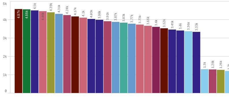
The expression I used to generate this chart is
=Count(TOTAL expiration_date_gmt) - RangeSum(Above(Count(expiration_date_gmt), 1, RowNo()))
I want to represent this bar chart as a pivot table or table, and instead of showing the sum of 4 members type over month, I want to show individual members type over month.
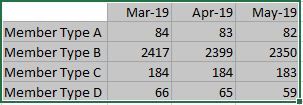
I used back the same expression and I realise that the figures appearing in the cells are all close to 4.57k, which is the total members type in the first bar.
Anyone has any suggestions on how to do it?

.png "Former Employee") Wlad_Masi
Wlad_Masi
- Mark as New
- Bookmark
- Subscribe
- Mute
- Subscribe to RSS Feed
- Permalink
- Report Inappropriate Content
