Unlock a world of possibilities! Login now and discover the exclusive benefits awaiting you.
- Qlik Community
- :
- Forums
- :
- Analytics
- :
- Topics
- :
- Visualization and Usability
- :
- Follow-up question about line charts and the scrol...
- Subscribe to RSS Feed
- Mark Topic as New
- Mark Topic as Read
- Float this Topic for Current User
- Bookmark
- Subscribe
- Mute
- Printer Friendly Page
- Mark as New
- Bookmark
- Subscribe
- Mute
- Subscribe to RSS Feed
- Permalink
- Report Inappropriate Content
Follow-up question about line charts and the scroll bar
Hello,
I asked a prior question (Re: When I create a line chart, a second mini version of the line chart appears below my chart. What... for reference) and thought I understood the answer, but now I am still confused.
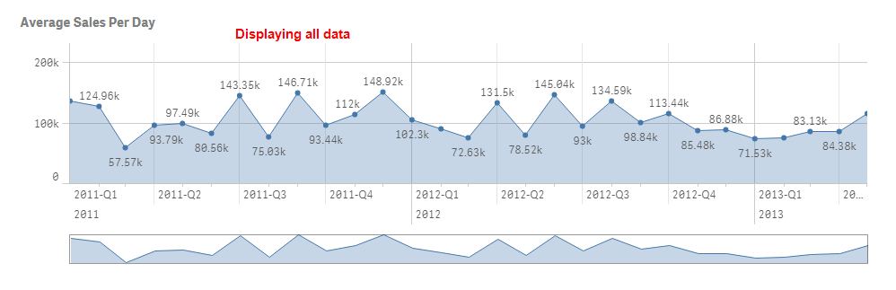
I am using QlikSense desktop. My question is still about line charts and why they appear with a second mini version of the chart below the primary chart.
I would like the line charts to only have the top chart, and the mini chart below the top chart seems to serve to purpose other than distraction.
I was told it is a scroll bar, but it appears even if all of my data is already on display. Additionally, if, say you zoom in on 2012 only the mini chart below the top one also zooms in on the exact same months.
So all I can really tell is that the lower chart is just a compressed view of the top chart which I cannot for the life of me understand it's purpose.
Any help here? Can I turn these off entirely through a setting?

- Mark as New
- Bookmark
- Subscribe
- Mute
- Subscribe to RSS Feed
- Permalink
- Report Inappropriate Content
Forgot to say thanks to anyone for taking the time to read or answer this, thx for helping a noobie.