Unlock a world of possibilities! Login now and discover the exclusive benefits awaiting you.
Announcements
Now accepting applications for the Qlik Luminary and Partner Ambassador Programs: Apply by July 6!
- Qlik Community
- :
- Forums
- :
- Analytics & AI
- :
- Products & Topics
- :
- Visualization and Usability
- :
- Selections in new Map Chart (April 2018)
Options
- Subscribe to RSS Feed
- Mark Topic as New
- Mark Topic as Read
- Float this Topic for Current User
- Bookmark
- Subscribe
- Mute
- Printer Friendly Page
Turn on suggestions
Auto-suggest helps you quickly narrow down your search results by suggesting possible matches as you type.
Showing results for
Partner - Contributor
2018-04-24
02:59 AM
- Mark as New
- Bookmark
- Subscribe
- Mute
- Subscribe to RSS Feed
- Permalink
- Report Inappropriate Content
Selections in new Map Chart (April 2018)
Hi,
Just testing out the map chart in Qlik Sense April 2018.
Selecting a country looks (in my opinion) aweful when the country is not zoomed in.
Attaching example.
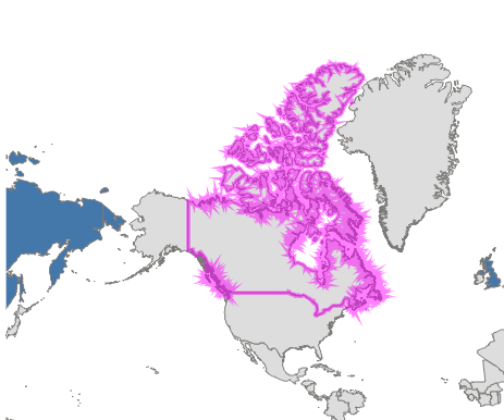
Magenta seems to be default?
I realize that the edges look like this because the shape is so detailed. Some smoothing function would be nice.
Guess you have to accept this appearance... or?
Regards Tomas.
557 Views
0 Replies