Unlock a world of possibilities! Login now and discover the exclusive benefits awaiting you.
Announcements
Now accepting applications for the Qlik Luminary and Partner Ambassador Programs: Apply by July 6!
- Qlik Community
- :
- Forums
- :
- Analytics & AI
- :
- Products & Topics
- :
- Visualization and Usability
- :
- XY scatter
Options
- Subscribe to RSS Feed
- Mark Topic as New
- Mark Topic as Read
- Float this Topic for Current User
- Bookmark
- Subscribe
- Mute
- Printer Friendly Page
Turn on suggestions
Auto-suggest helps you quickly narrow down your search results by suggesting possible matches as you type.
Showing results for
Not applicable
2016-07-15
12:35 AM
- Mark as New
- Bookmark
- Subscribe
- Mute
- Subscribe to RSS Feed
- Permalink
- Report Inappropriate Content
XY scatter
Hi All,
Could someone help me with the following:
I have multiple years worth of data for different analytes for multiple sites and I am looking to show this as a xy scatter graph similar to this one generated from excel (the trend lines are not necessary to show):

I am not sure if I should be using a line chart or a scatter plot?
I can generate the following using a line graph but can't find out how to only show data points (no lines between years)
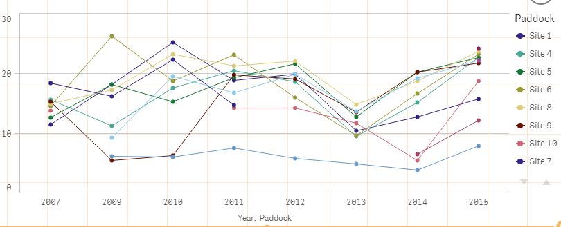
Any ideas would be great!
510 Views
0 Replies