Unlock a world of possibilities! Login now and discover the exclusive benefits awaiting you.
- Qlik Community
- :
- Forums
- :
- Analytics & AI
- :
- Products & Topics
- :
- Visualization and Usability
- :
- Treemaps In Qlik Sense
- Subscribe to RSS Feed
- Mark Topic as New
- Mark Topic as Read
- Float this Topic for Current User
- Bookmark
- Subscribe
- Mute
- Printer Friendly Page
- Mark as New
- Bookmark
- Subscribe
- Mute
- Subscribe to RSS Feed
- Permalink
- Report Inappropriate Content
Treemaps In Qlik Sense
Hi,
I have started using QlikSense and have developed sample reports in the same. In one of the reports I have used TreeMap as a chart. I wanted to check if in a treemap, only the highest values are prominent/visible when any selections are not made? Once I make any selections then the small/other values are appearing otherwise its only the higher values visible. Please let me know on this.
Accepted Solutions
- Mark as New
- Bookmark
- Subscribe
- Mute
- Subscribe to RSS Feed
- Permalink
- Report Inappropriate Content
Hello Hjgh - a Treemap is used to display hierarchical type data. So depending on the selections and the configuration order of the columns, the Treemap display will vary. However ALL values will be displayed, but the largest ones via the size of the box and the top position will be prominent. There isn't any sorting property for the Treemap, the highest values are always front and center, on top etc.
Here are some examples:
In this screenshot - I have Year, Quarter, Month, Category Name - in my column order - Month is in Quarter and Quarters are within Years. I added Category after month.
So the highest sales are in 2012, Q1 first, 2011 2nd etc.
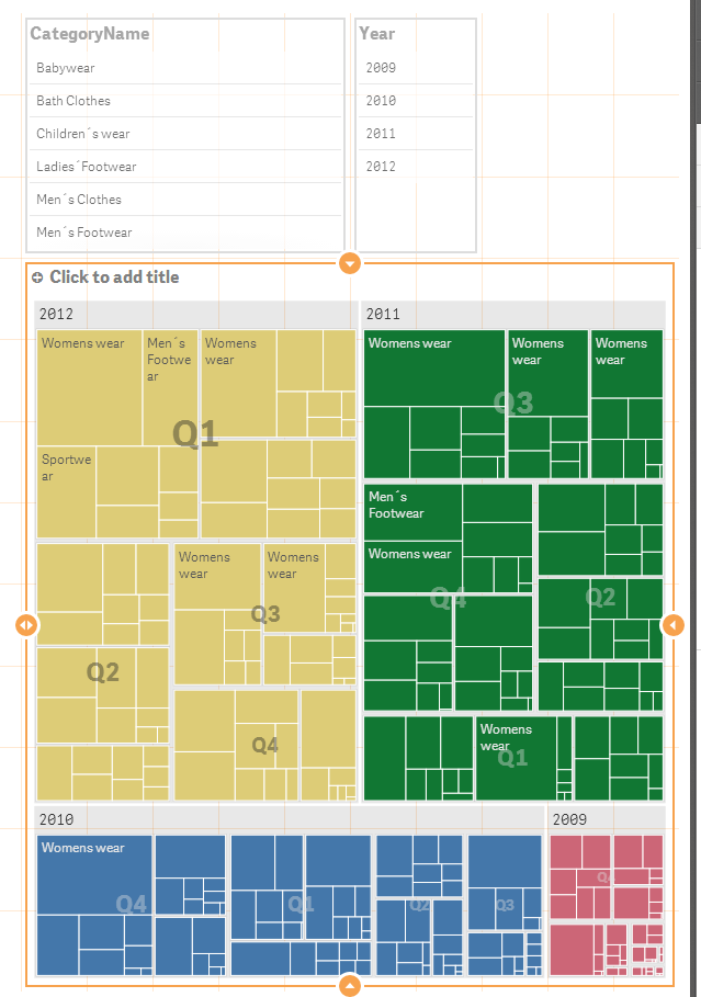
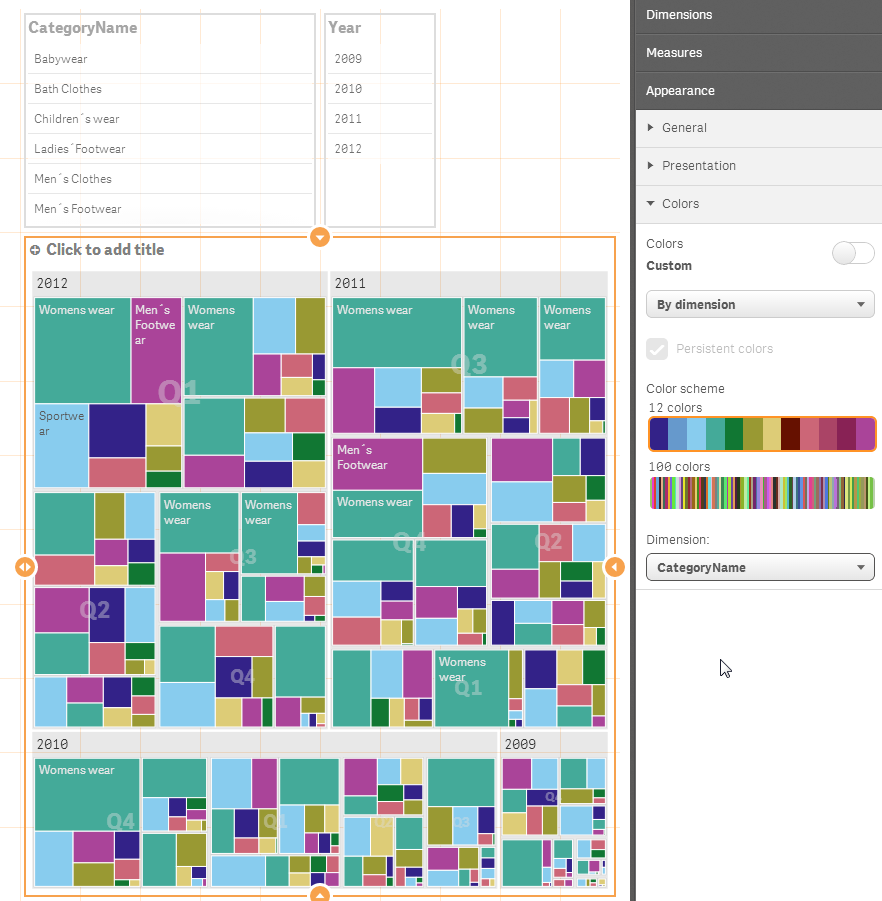
The default is to color by the top level dimension, but I can change that to color by dimension and choose Category.
Doing so allows me to see color and size that I can easily distinguish for many values, within Years, Quarters and month. Such as Womens wear dominates sales in all years and most quarters, with 2012 being the highest.
When Selections are made - the Treemap will vary the size of the boxes due to the size of the value and reorder them with the largest values on top.
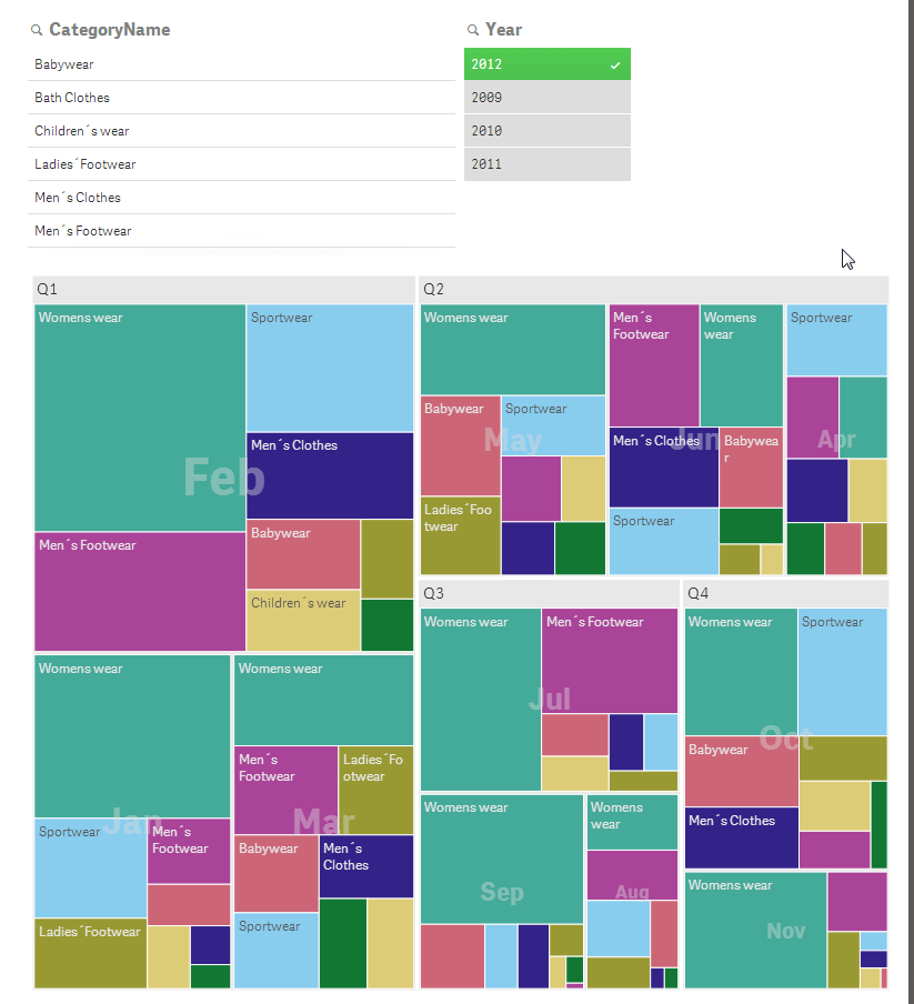
Selecting 2012 - simply removes the other years from the treemap.
If I add Country to the mix and reorder the columns - so Country, Category, Year, Quarter, Month it looks like this:
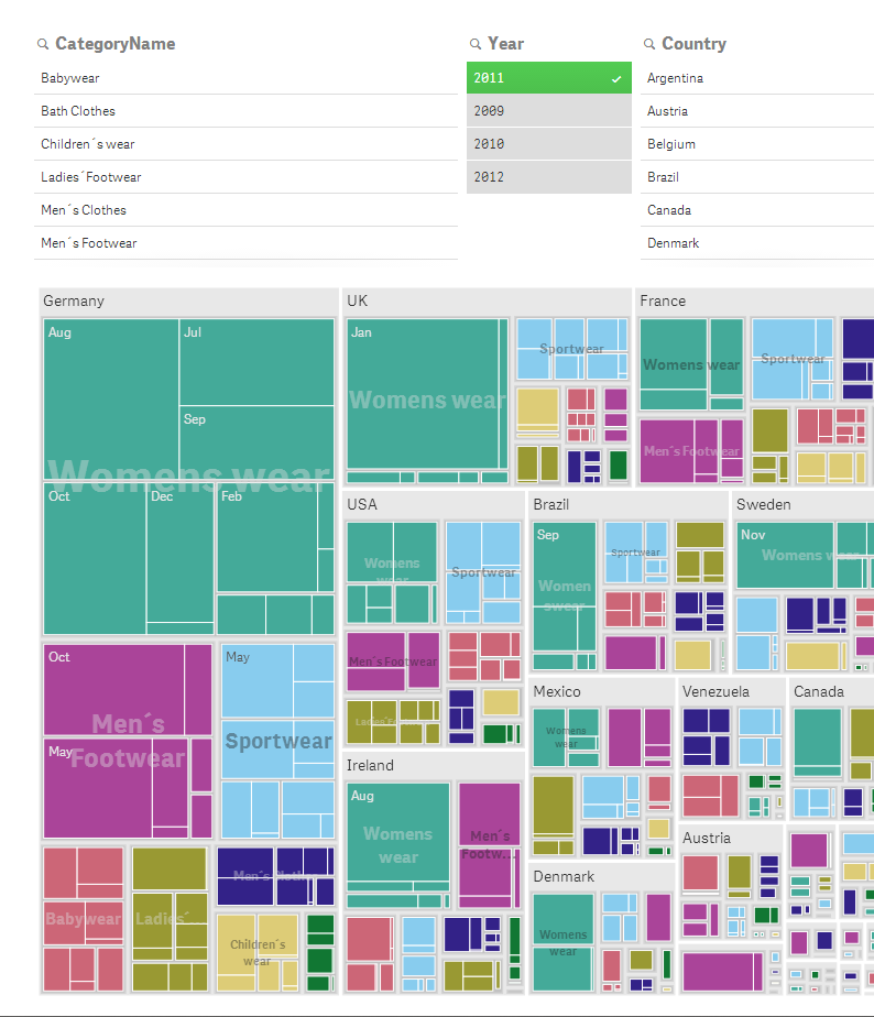
Where Germany is on top for Womens Wear sales followed by the UK etc.
Hope this helps.
Mike
Mike Tarallo
Qlik
- Mark as New
- Bookmark
- Subscribe
- Mute
- Subscribe to RSS Feed
- Permalink
- Report Inappropriate Content
Hello Hjgh - I have "branched" your discussion to a new topic. We will review your question and respond shortly.
Mike
Mike Tarallo
Qlik
- Mark as New
- Bookmark
- Subscribe
- Mute
- Subscribe to RSS Feed
- Permalink
- Report Inappropriate Content
Hello Hjgh - a Treemap is used to display hierarchical type data. So depending on the selections and the configuration order of the columns, the Treemap display will vary. However ALL values will be displayed, but the largest ones via the size of the box and the top position will be prominent. There isn't any sorting property for the Treemap, the highest values are always front and center, on top etc.
Here are some examples:
In this screenshot - I have Year, Quarter, Month, Category Name - in my column order - Month is in Quarter and Quarters are within Years. I added Category after month.
So the highest sales are in 2012, Q1 first, 2011 2nd etc.
The default is to color by the top level dimension, but I can change that to color by dimension and choose Category.
Doing so allows me to see color and size that I can easily distinguish for many values, within Years, Quarters and month. Such as Womens wear dominates sales in all years and most quarters, with 2012 being the highest.
When Selections are made - the Treemap will vary the size of the boxes due to the size of the value and reorder them with the largest values on top.
Selecting 2012 - simply removes the other years from the treemap.
If I add Country to the mix and reorder the columns - so Country, Category, Year, Quarter, Month it looks like this:
Where Germany is on top for Womens Wear sales followed by the UK etc.
Hope this helps.
Mike
Mike Tarallo
Qlik
- Mark as New
- Bookmark
- Subscribe
- Mute
- Subscribe to RSS Feed
- Permalink
- Report Inappropriate Content
Hi Hjgh,
In a tree map we only show the label and value if the rectangle has the space for it. If you don't see anything in a rectangle it's because the label and/or the value is too large to be displayed within that area.
Regards,
Patrik
- Mark as New
- Bookmark
- Subscribe
- Mute
- Subscribe to RSS Feed
- Permalink
- Report Inappropriate Content
Hi Patrik,
I've hit a snag with a tree map in Sense - can you confirm if this is expected behaviour please? It seems the expression in the first dimension simply sums the values of the second dimension together. So, if you have Sum(Sales) by Continent and Country then the value shown at the Continent level is simply a sum of the sales of the associated Countries. For Sum(Sales) this is obviously fine, but when you look at margins it breaks. Individual Countries show correctly (34%, 48%, 65% etc) but at the Continent level it is simply summing the % values together giving 34+48+65=127%!
In every chart in QlikView the expression is calculated at whatever level (Dimensionality()) you are in, so why is Sense not doing the same!?
I can't see a way to turn off the value or show zero instead - very frustrating! 😞 Is this recognised and will it change in a later release?
Thanks,
Jason