Unlock a world of possibilities! Login now and discover the exclusive benefits awaiting you.
- Qlik Community
- :
- Forums
- :
- Analytics
- :
- New to Qlik Analytics
- :
- Distribution plot with 1 dimension
- Subscribe to RSS Feed
- Mark Topic as New
- Mark Topic as Read
- Float this Topic for Current User
- Bookmark
- Subscribe
- Mute
- Printer Friendly Page
- Mark as New
- Bookmark
- Subscribe
- Mute
- Subscribe to RSS Feed
- Permalink
- Report Inappropriate Content
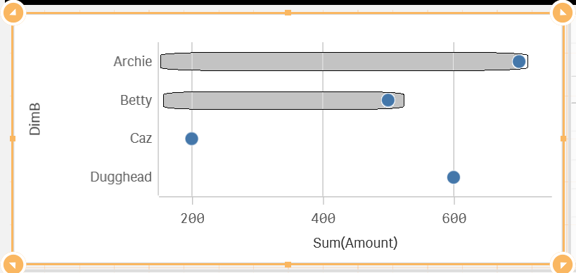
Distribution plot with 1 dimension
Hi
I'm playing around with the distribution plot chart a bit.
Trying to get it right to show a distribution plot chart with the range of values for that 1 dimension.
It seems with the distribution plot, the 1st dimension is the calculation, 2nd the name and then the measure.
But if I wanted to have it similar to a bar chart, 1 dimension splits the names but then
the measure shows the min/max (as the same with the distribution plot & unlike the bar chart)
How would one do this?
Playing around with data like this just to understand the chart conceptually
(i.e. data can be changed/manipulated)
DATA:
LOAD * Inline [
DimA, DimB, Amount
A, Archie, 50
A, Betty, 2000
A, Caz, 1500
A, Dugghead, 1800
A, Archie, 100
A, Archie, 200
A, Archie, 400
A, Betty, 100
A, Betty, 100
A, Archie, 100
A, Dugg, 400
A, Dugg, 800
A, Dugg, 200
A, Dugg, 300
A, Dugg, 200
A, Betty, 500
A, Betty, 600
A, Archie, 1100
A, Caz, 100
A, Archie, 100
];
- Mark as New
- Bookmark
- Subscribe
- Mute
- Subscribe to RSS Feed
- Permalink
- Report Inappropriate Content
I think the amount of data rows is just too small...
- Mark as New
- Bookmark
- Subscribe
- Mute
- Subscribe to RSS Feed
- Permalink
- Report Inappropriate Content
?
You should be able to do this with 4 lines of data
(however the distribution chart forces you to take 2 dimensions)
DimA, Amount
Archie, 50
Archie, 200
Betty, 100
Betty, 300
Should display
Archie 50 ---------- 200
Betty 100 -------------300
- Mark as New
- Bookmark
- Subscribe
- Mute
- Subscribe to RSS Feed
- Permalink
- Report Inappropriate Content
..but it doesn't since it uses GetHyperCubeStackData method. Maybe it's just wrong implemented.