Unlock a world of possibilities! Login now and discover the exclusive benefits awaiting you.
- Qlik Community
- :
- Forums
- :
- Analytics
- :
- New to Qlik Analytics
- :
- Adding Differences between Bars in a Bar Chart
- Subscribe to RSS Feed
- Mark Topic as New
- Mark Topic as Read
- Float this Topic for Current User
- Bookmark
- Subscribe
- Mute
- Printer Friendly Page
- Mark as New
- Bookmark
- Subscribe
- Mute
- Subscribe to RSS Feed
- Permalink
- Report Inappropriate Content
Adding Differences between Bars in a Bar Chart
Hi,
I have a bar chart detailing figures per month in Qlik Sense. I would like to add a figure between the adjacent bars that tells me what the difference between the two figures is. Similarly, if I select two bars across the chart it will change to show the difference between those figures.
Is this possible? Or is there a different way to show the progression between bars (not a waterfall diagram)?
Many Thanks,
L
- Mark as New
- Bookmark
- Subscribe
- Mute
- Subscribe to RSS Feed
- Permalink
- Report Inappropriate Content
you could use an expression like below:
column(1) - above(column(1))
where 1 means the first measure
I hope this helps.
- Mark as New
- Bookmark
- Subscribe
- Mute
- Subscribe to RSS Feed
- Permalink
- Report Inappropriate Content
Hi Andrea,
Thanks for your reply. That's a really good way to show it with another bar.
Do you know if it's possible to for example have lines between the bars with the figure showing or any similar ways?
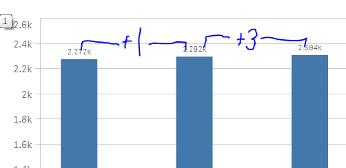
E.g.
Thanks!
- Mark as New
- Bookmark
- Subscribe
- Mute
- Subscribe to RSS Feed
- Permalink
- Report Inappropriate Content
As I know you can't with native obejcts.
Anyway you can take a look for some extensions on Branch here Qlik Branch
- Mark as New
- Bookmark
- Subscribe
- Mute
- Subscribe to RSS Feed
- Permalink
- Report Inappropriate Content
Hi Laurence,
if want to show that differences, I suggest you to use waterfall chart.
G.