Unlock a world of possibilities! Login now and discover the exclusive benefits awaiting you.
- Qlik Community
- :
- All Forums
- :
- QlikView
- :
- Bar Chart 2 Dimentions sorting
- Subscribe to RSS Feed
- Mark Topic as New
- Mark Topic as Read
- Float this Topic for Current User
- Bookmark
- Subscribe
- Mute
- Printer Friendly Page
- Mark as New
- Bookmark
- Subscribe
- Mute
- Subscribe to RSS Feed
- Permalink
- Report Inappropriate Content
Bar Chart 2 Dimentions sorting
Hi all
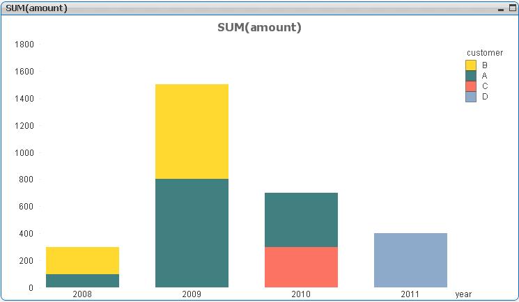
I would like to sort a bar chart by period and by customer.
Meaning that small customers will be on top of the big every period.
For example : in the screenshot below, Customer B (Yellow) will be below A in 2008
qvw file attached.
Thanks for your help
Ori
Accepted Solutions
- Mark as New
- Bookmark
- Subscribe
- Mute
- Subscribe to RSS Feed
- Permalink
- Report Inappropriate Content
With some messing about it can be done. See attached qvw.
talk is cheap, supply exceeds demand
- Mark as New
- Bookmark
- Subscribe
- Mute
- Subscribe to RSS Feed
- Permalink
- Report Inappropriate Content
Hi,
i diged much but finally giving you a thread with similar issue may it help you..
- Mark as New
- Bookmark
- Subscribe
- Mute
- Subscribe to RSS Feed
- Permalink
- Report Inappropriate Content
Hi Son Of Sardar, the 2nd link is more relevant but still doesn't promote me to the result.
Thanks anyway
- Mark as New
- Bookmark
- Subscribe
- Mute
- Subscribe to RSS Feed
- Permalink
- Report Inappropriate Content
With some messing about it can be done. See attached qvw.
talk is cheap, supply exceeds demand
- Mark as New
- Bookmark
- Subscribe
- Mute
- Subscribe to RSS Feed
- Permalink
- Report Inappropriate Content
Nice solution Gysbert!
I think you can simplify the color expressions to:
=color(FieldIndex('customer', customer))
If you use a dual() for the calculated dim you can get the Customer name in the pop-up
=aggr( dual( only(customer) , sum(amount) ) ,year,customer)
Ideally, that would work as the legend also and then the seperate legend chart wouldn't be required. But the legend groups by the numeric value -- I couldn't get it to display just the string customer values.
See attached.
-Rob
- Mark as New
- Bookmark
- Subscribe
- Mute
- Subscribe to RSS Feed
- Permalink
- Report Inappropriate Content
Thanks for the quick and accurate answer!
- Mark as New
- Bookmark
- Subscribe
- Mute
- Subscribe to RSS Feed
- Permalink
- Report Inappropriate Content
Actually, I later realized I already had added a color field to the table to link the customers with a color. So I could just have used color([color]) instead.
Thanks for the suggestion about using the dual function. That's a new trick for me with regards to making the popup look nice.
talk is cheap, supply exceeds demand
- Mark as New
- Bookmark
- Subscribe
- Mute
- Subscribe to RSS Feed
- Permalink
- Report Inappropriate Content
My point on color() was that there was no need for a color field. You can use the naturally occuring FieldIndex() to derive the same value.
-Rob
- Mark as New
- Bookmark
- Subscribe
- Mute
- Subscribe to RSS Feed
- Permalink
- Report Inappropriate Content
Ahaa, I get it now. Cool. Thanks for educating me some more. 
talk is cheap, supply exceeds demand