Unlock a world of possibilities! Login now and discover the exclusive benefits awaiting you.
- Qlik Community
- :
- All Forums
- :
- QlikView
- :
- Changing the Colour of the bars on a barchart acco...
- Subscribe to RSS Feed
- Mark Topic as New
- Mark Topic as Read
- Float this Topic for Current User
- Bookmark
- Subscribe
- Mute
- Printer Friendly Page
- Mark as New
- Bookmark
- Subscribe
- Mute
- Subscribe to RSS Feed
- Permalink
- Report Inappropriate Content
Changing the Colour of the bars on a barchart according to there value?
Hi,
I am having trouble changing the background colour of the bars of a chart I am creating.
I want the bars to change colour based on their value, and I am putting this calculation into the background colour.
I had originaly tried to do this using an 'IF' statement, however it failed as the value I am calculating is the accumulative of a sales value.
It seams that the background colour dose not pick up accumulation?
I also tried a RangeSum equation below;
This also fails as the background colour dose not pick up the sort of the graph, which sorts the values from Highest sales to lowest sales. The problem with this is that the graph then displays random figures in different colours, rather than the highest all in dark blue at the top leading down to the light blue being the lowest.
For example the graph displays as follows:
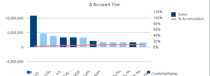
What I need is for the Sales bars (Total sales) to change colour based on the percentage of sales thay are (Sales/TotalSales) for each customer.
This way I can show the graph with colours range from higest sales to lowest sales. This allows the user to visibly see which section their customers sales are in.
Light blue being Section 3 (<=50%)
Medium Blue being Section 2 (<=80%)
and Section 1 being Dark blue (>80)
Id really appriciate some help with this if anyone had any suggestions, as Im starting to wonder can it be done?
Thanks
- Mark as New
- Bookmark
- Subscribe
- Mute
- Subscribe to RSS Feed
- Permalink
- Report Inappropriate Content
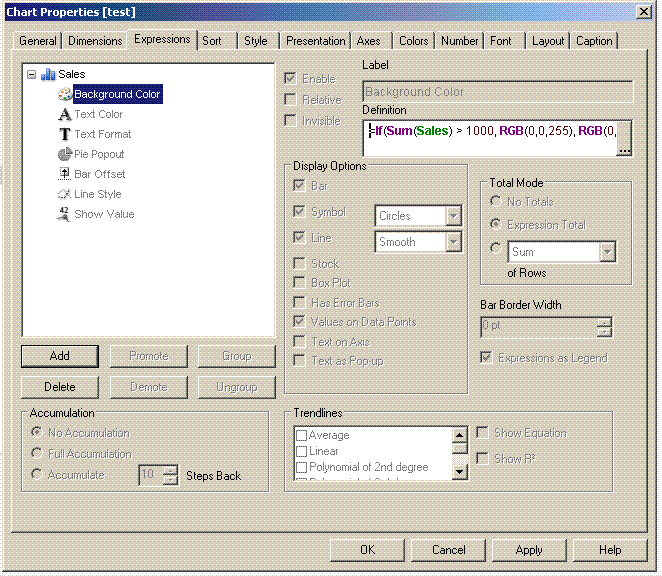
just on expressions click on + sighn and go to the Background option.
Paste a sample .
- Mark as New
- Bookmark
- Subscribe
- Mute
- Subscribe to RSS Feed
- Permalink
- Report Inappropriate Content
Hi,
Expand the + icon and click the Background option and give your expression in that.
Hope it helps you.
Regards,
Jagan.
- Mark as New
- Bookmark
- Subscribe
- Mute
- Subscribe to RSS Feed
- Permalink
- Report Inappropriate Content
No I know how to open the background colour option and put in an expression, as i had done this to get the two dofferent blues shown above in the graph, that's not the problem.
My issue is that I want the background colour to sort with the graph, at the moment it is not sorting, as if it was you would see a perito in the colouring on the bars.
I am wondering dose anyone know how to make the background colour SORT to the same settings as the graph, as i need it in Y - Desending order.
Also the background expression dose not seem to have an accumulation option?
I need the sales expression to accumulate?
I need the expression in the background to show the tiering from 50% - 100% as shown in my original query.
Thanks
- Mark as New
- Bookmark
- Subscribe
- Mute
- Subscribe to RSS Feed
- Permalink
- Report Inappropriate Content
No I know how to open the background colour option and put in an expression, as i had done this to get the two different blues shown above in the graph, that's not the problem.
My issue is that I want the background colour to sort with the graph, at the moment it is not sorting, as if it was you would see a perito in the colouring on the bars.
I am wondering dose anyone know how to make the background colour SORT to the same settings as the graph, as i need it in Y - Descending order.
Also the background expression dose not seem to have an accumulation option?
I need the sales expression to accumulate? I need the expression in the background to show the tiring from 50% - 100% as shown in my original query.
Thanks