Unlock a world of possibilities! Login now and discover the exclusive benefits awaiting you.
- Qlik Community
- :
- All Forums
- :
- QlikView App Dev
- :
- Bar Chart Scale
- Subscribe to RSS Feed
- Mark Topic as New
- Mark Topic as Read
- Float this Topic for Current User
- Bookmark
- Subscribe
- Mute
- Printer Friendly Page
- Mark as New
- Bookmark
- Subscribe
- Mute
- Subscribe to RSS Feed
- Permalink
- Report Inappropriate Content
Bar Chart Scale
Hi.
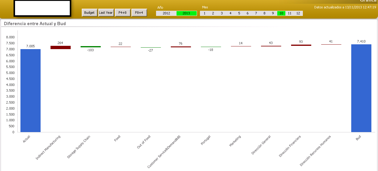
I have a problem with the chart shown below. 1st bar is the Actual result. Last bar is the comparison bar, and it changes with the buttons on top. Other bars are the dimensioned difference between 1st and last bar.
My problem is: Users don’t get to see clearly those differences because the bars representing them are too thin. Some of them are only a pixel high.
I’ve already tried Logarithmic Scale but it does not do anything. Also, notice the negative values. I’ve tried multiplying by 10 or 100 the middle bars, but then, values on data points are multiplied too.
What I do with paint program is change origin for 2 big bars and rescale the rest, but… how to do it in the chart?
Please send any suggestion.
Thank you.
Actual chart.
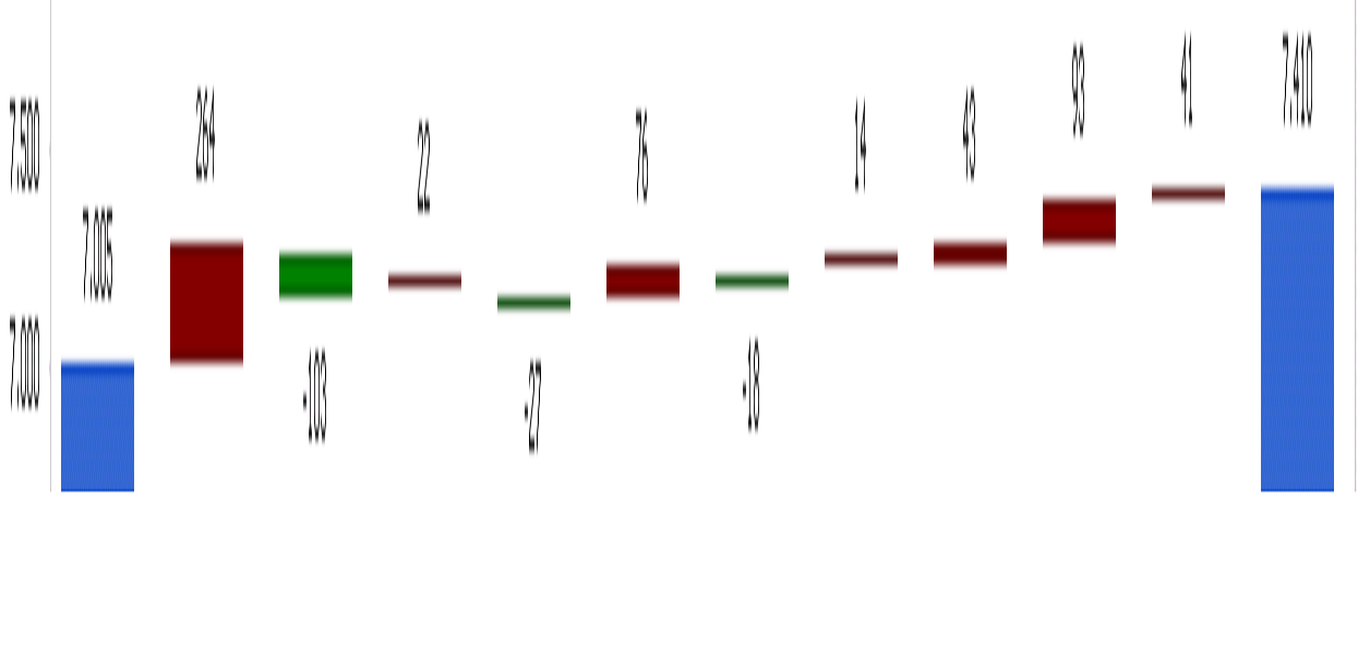
Desired chart.
Accepted Solutions
- Mark as New
- Bookmark
- Subscribe
- Mute
- Subscribe to RSS Feed
- Permalink
- Report Inappropriate Content
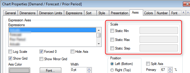
You could use formulas in the Static Min and Static Max boxes to change the scale dynamically based on max() and min() values.
- Mark as New
- Bookmark
- Subscribe
- Mute
- Subscribe to RSS Feed
- Permalink
- Report Inappropriate Content
You could use formulas in the Static Min and Static Max boxes to change the scale dynamically based on max() and min() values.
- Mark as New
- Bookmark
- Subscribe
- Mute
- Subscribe to RSS Feed
- Permalink
- Report Inappropriate Content
Perfect!!! 
Why I didn't see that before? 
Well, that's why there is a community.
Thanks a lot Kai.
- Mark as New
- Bookmark
- Subscribe
- Mute
- Subscribe to RSS Feed
- Permalink
- Report Inappropriate Content
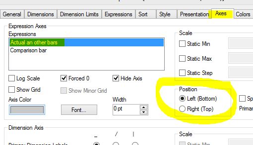
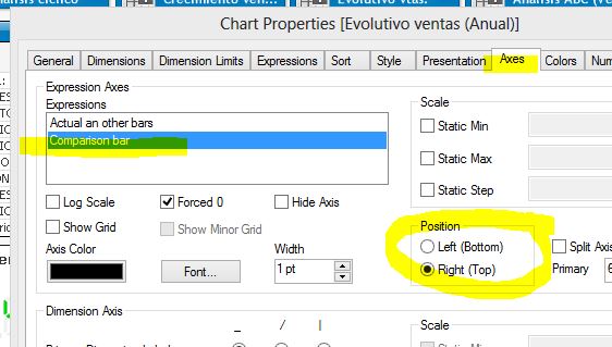
You can change the "Position" property in the Axes sheet of the graphic properties and asign diferent "Static Max" values.