Unlock a world of possibilities! Login now and discover the exclusive benefits awaiting you.
- Qlik Community
- :
- Blogs
- :
- Technical
- :
- Design
- :
- The Importance of Data Visualization
- Subscribe to RSS Feed
- Mark as New
- Mark as Read
- Bookmark
- Subscribe
- Printer Friendly Page
- Report Inappropriate Content
In 1973 English statistician Francis Anscombe published the paper Graphs in Statistical Analysis to stress the importance of data visualization. He wanted to show that graphs are essential to good statistical analysis. Commonly referred to as Anscombe's Quartet, he created four data sets of x & y coordinates whose statistical properties of mean, variance, etc. are nearly identical. He then graphed these data sets as four scatter plot charts and demonstrated just how different the data sets really were.
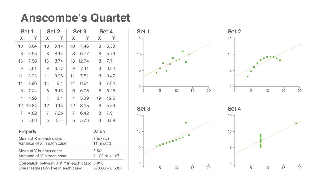
These charts are an integral part of comprehending the data because we can instantaneously see the differences between the scatter plots, a task that would take much longer if we were to rely solely on the data table. The chart and the table are working together to give us the complete story. Anscombe's point was that the chart isn't subordinate to the data table. Both the data table and the chart help the reader understand the data but in different ways.
Good data visualization works because our brains are hardwired to rapidly process visual stimuli using very little conscious effort. Even before actively reading the charts your brain has pre-attentively processed the information to spot the patterns, the similarities and the differences.
So when planning your application consider tables AND charts rather than tables OR charts. They are two ways to learn the complete story in the data.
You must be a registered user to add a comment. If you've already registered, sign in. Otherwise, register and sign in.