Unlock a world of possibilities! Login now and discover the exclusive benefits awaiting you.
- Subscribe to RSS Feed
- Mark as New
- Mark as Read
- Bookmark
- Subscribe
- Printer Friendly Page
- Report Inappropriate Content
We all can agree on the fact that not all the data contained in an app is equally important, right? The most important data should be highly visible and be located in a prime location within your app. Is always interesting to recheck Michael Anthony’s post about hierarchy.
KPIs are one of those elements that for sure will be at the very top of your app's first sheet, it's something you don’t want anyone to miss.
Since we don’t have a KPI object in QlikView’s objects library, all of us have came up with different solutions and tricks to represent a value and some contextual information next to it. All of them have one common aspect, they require several text objects to look good. This is usually ok, is not that hard to achieve a nice looking KPI using multiple text objects, but it can be really tedious to maintain.
The object below shows an example of a KPI representing net sales, it also contains other key contextual information such as comparison vs previous year and comparison vs target. The KPI also includes graphical indicators that will let us know if the measured indicator is performing good or bad based on our goals.
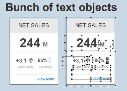
It looks really neat but in order to achieve something like that in QlikView you will need to create and maintain a good amount of text objects as you can see.
Today we introduce yet another alternative to text objects, it's a really smart, sexy looking, and easy-to-manage KPI object. And it’s all done using only one object! Let’s see how it’s done.
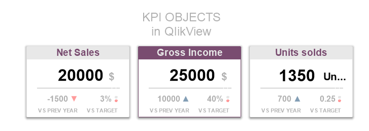
Each one of those three KPI objects are in fact a gauge chart heavily tweaked to look like a completely new KPI object. To do so you need to remove the gauge image in the gauge chart and add some text boxes as “Text in Chart”. Good news is, it all belongs to the same object now so you will be able to move it around without missing any part.
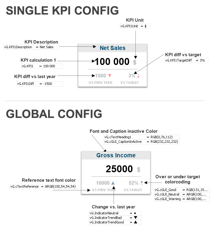
My very favorite piece of this method is the flexibility obtained by using variables to modify each one of the moving parts that form the object making it a piece of cake to maintain. Next, I’m including a diagram of the object so you can get a better understanding of it.
PROS:
- Simplified administration.
- Global configuration options = unified look&feel.
- Manageability, no more loose parts when moving/copying objects across sheets.
- Minor tweaks to replicate across projects.
CONS:
- It might be a bit confusing for newbies due the intensive use of variables.
I’m attaching an app (qvw) so you can just copy and paste it to your new project and explore how it's done.
Enjoy it!
AMZ
PS: All kudos must go to Rasmus Andersson and Alexander Mosquera alexmosq at Mindcamp and Fredrik Thomsen and Peter Wedebrant @Qlik.
- « Previous
-
- 1
- 2
- 3
- 4
- Next »
You must be a registered user to add a comment. If you've already registered, sign in. Otherwise, register and sign in.