Unlock a world of possibilities! Login now and discover the exclusive benefits awaiting you.
- Subscribe to RSS Feed
- Mark as New
- Mark as Read
- Bookmark
- Subscribe
- Printer Friendly Page
- Report Inappropriate Content
Since the introduction of Data Manager (the Data manager is where you visually add and manage data from your own data sources, or from Qlik DataMarket, so that you can use it in your app) Qlik has been constantly improving the set of features that makes the task of loading data an enjoyable part of the analysis process.
One of the most recent (and genius) additions to Data Manager is the “Summary card”
So what is the Summary card?
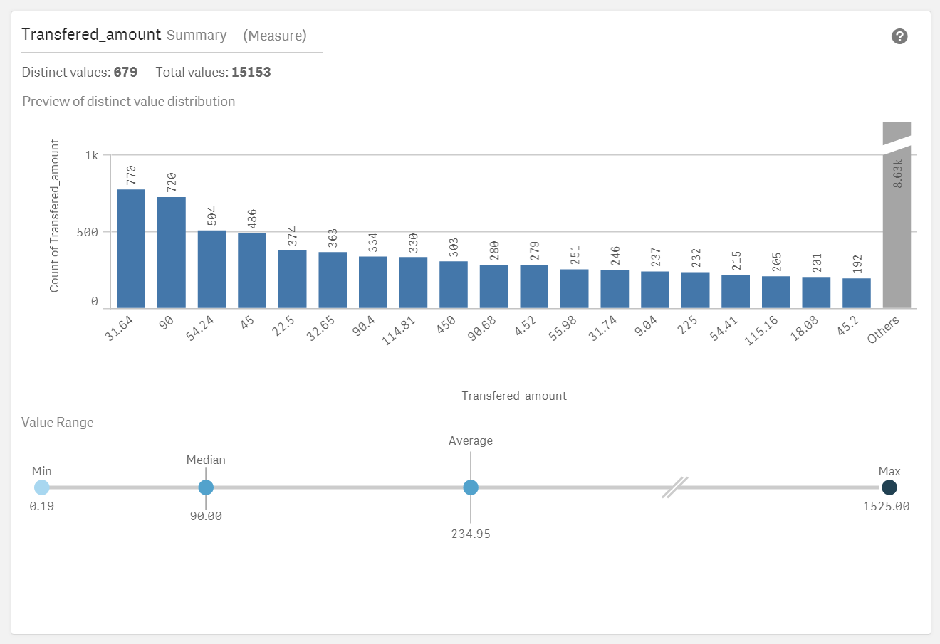
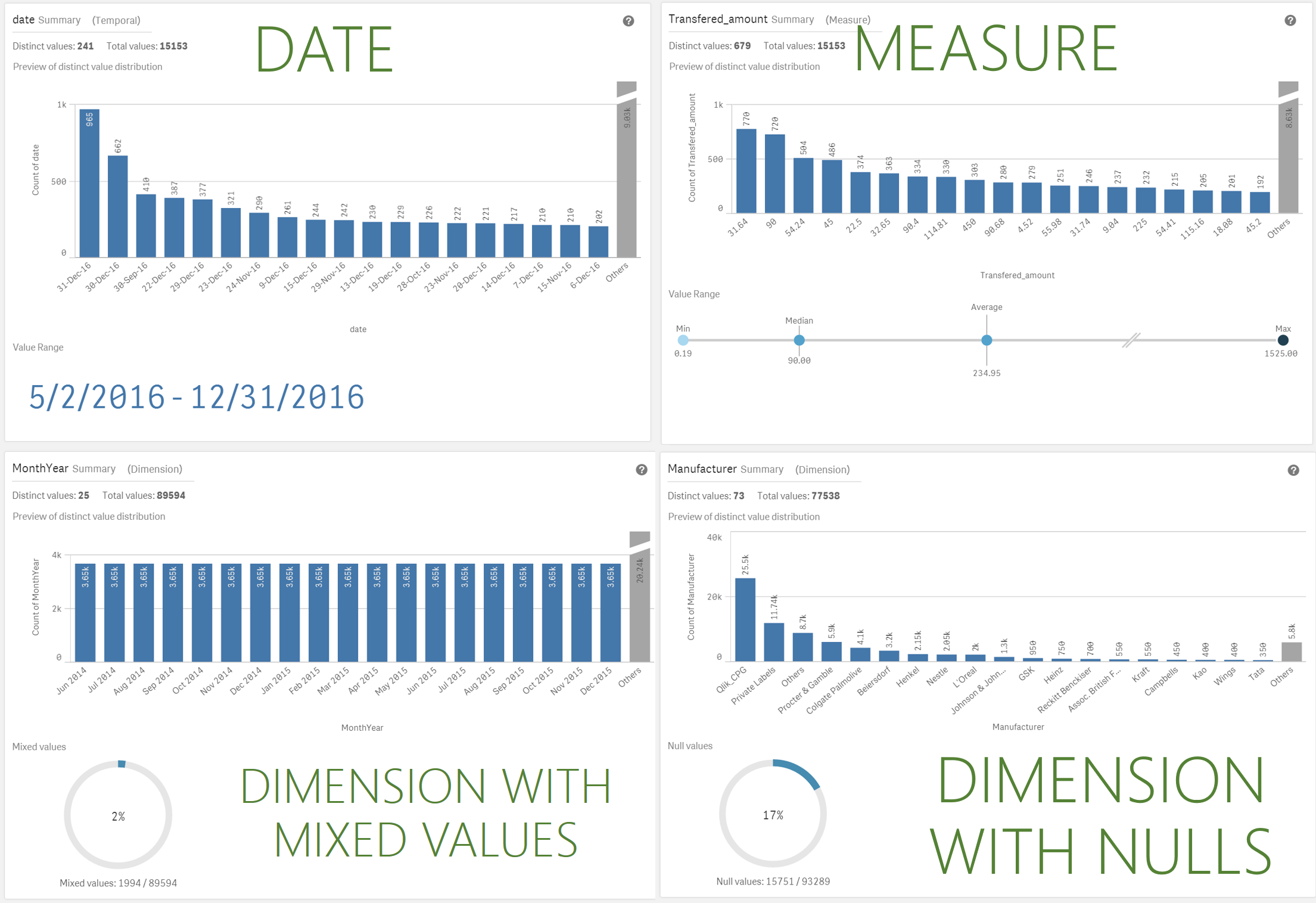
Summary data profiling card is a visual representation of your data. It contains a set of elements, values and charts, that let you better understand each field in your data set.
Summary card has been designed to help you anticipate and prevent data quality issues before loading data into Qlik Sense. The Summary card content adapts to the field selected, so depending on the column data type, measure, dimension, or time it will present you with different insights.
For measures the following information is provided
- Field name
- Field type
- Distinct Values
- Total Values
- Preview of the distinct value distribution in a bar chart showing the 20 highest count elements.
- Value Range. It is a very interesting chart itself, for a measure field it will show a distribution chart showing the Min, Median, Average, and Max values for the field.
If a temporal field is selected the Value Range will display the first and last date in the range. - Null Values and Mixed values charts only appears based on the field data.
How to access the Summary card
To see and use the Summary card by yourself you have to get to Data manager, In Data manager, select a table and click the pencil icon, then select a table field and the Summary card appears. Or just check the animation below:
Enjoy it!
Arturo (@arturoqv)
You must be a registered user to add a comment. If you've already registered, sign in. Otherwise, register and sign in.