Unlock a world of possibilities! Login now and discover the exclusive benefits awaiting you.
- Qlik Community
- :
- Support
- :
- Support
- :
- Knowledge
- :
- Support Articles
- :
- Qlik NPrinting PixelPerfect Stacked Lines Chart
- Subscribe to RSS Feed
- Mark as New
- Mark as Read
- Bookmark
- Subscribe
- Printer Friendly Page
- Report Inappropriate Content
Qlik NPrinting PixelPerfect Stacked Lines Chart
- Mark as New
- Bookmark
- Subscribe
- Mute
- Subscribe to RSS Feed
- Permalink
- Report Inappropriate Content
Qlik NPrinting PixelPerfect Stacked Lines Chart
Apr 19, 2022 5:26:09 AM
Sep 25, 2017 9:31:25 AM
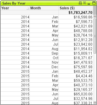
Suppose that you have a Qlik straight table with the columns Year, Month and sales like the following:
and you want to obtain a PixelPerfect chart with a line for each year and details by month like the following:

Environment:
- Create a new PixelPerfect template (or open an existing one, as you prefer) and add the source table to the Tables node.
- Create a new PixelPerfect chart and select the type Line Stacked. Click on Next 2 times.
- Change the name of Serie 1 to 2014 and the name of Serie 2 to 2015. Click on Next.
- Select the Series Binding tab and click on 2014 (the first serie). Click on the three dots on the right of Data filter, the Data Filter Collection Editor will open. Click on Add.
- Expand the Column Name drop down menu and select the Year field to filter values of that field. In the Value form type 2014. The first serie will contain only values that satisfy this filter.
- Open the Argument drop-down menu and select the Month column.
- Open the Value drop-down menu and select the Sales column.
- Repeat the process for the 2015 series. Click on Point Labels on the left column.
- Remove the visible flag for both series.
- Click on Finish, if necessary adjust the chart dimensions and run a preview.


- Mark as Read
- Mark as New
- Bookmark
- Permalink
- Report Inappropriate Content
Nice. Is it also possible to use the max of year and the max of year -1 instead of static values?
Regards,
Wouter
- Mark as Read
- Mark as New
- Bookmark
- Permalink
- Report Inappropriate Content
No, it is not possible to insert a formula instead of a fixed value.
- Mark as Read
- Mark as New
- Bookmark
- Permalink
- Report Inappropriate Content
Like i said - it is not possible to have 2 dimensions which in this case is a main factor.
My suggestion is more flexible as you can create measure for YEAR and measure for YEAR -1 in Qlik and have them dynamic on Qlik side.
Other steps would be similar to Ruggero's with only difference that in my solution you do not have to apply filters in PixelPerfect charts as they will be already filtered by set analysis expression.
regards
Lech
PS. Ruggero - do you thinkg you could ask R&D to consider building multidimensional charts in Pixel Perfect (as a feature request)? That would apply to multidimensional bar charts or stacked bar charts with dynamic stacks etc
- Mark as Read
- Mark as New
- Bookmark
- Permalink
- Report Inappropriate Content
Of course, I can ask!
- Mark as Read
- Mark as New
- Bookmark
- Permalink
- Report Inappropriate Content
Good Idea to make two measures. But you also have static names for the series.
The use of variables would be nice
Wouter
- Mark as Read
- Mark as New
- Bookmark
- Permalink
- Report Inappropriate Content
Thanks for the article and alternative solutions! I also work with set analysis in Qlik for the single expressions. The major problem in both solutions is the name displayed in the legend. It's not dynamic.
@Lech_Miszkiewicz @Ruggero_Piccoli
Is there a solution for displaying the field value in the legend?
Thank you so much.
- Mark as Read
- Mark as New
- Bookmark
- Permalink
- Report Inappropriate Content
Hi,
Your request is not clear to me. Legend is for the categories of data so you see the category names there.
Maybe you need to use Point Labels to add the values of the point in the chart.
Let me know if this helps.
Best Regards,
Ruggero
- Mark as Read
- Mark as New
- Bookmark
- Permalink
- Report Inappropriate Content
Thanks for answering!
In the first screen shot we can set an expression for the label.

This variabel displays in this case the name of the 5 portfolios selected simulating a second dimention with set analysis.

In the PixelPerfect Template we can set only a fixed name for the series for the same chart comming from Qlik for each expression.

The final result is shown below. The legend shows only the fixed names like in the series but not the result of the expressions like in the original Qlik Sense chart.

Is there a way to display the names of the expressions in PxP with an expression or variable?
Can we overwrite the labels with a script where we can lookup for the variable results?
Thanks for your reply!