Unlock a world of possibilities! Login now and discover the exclusive benefits awaiting you.
- Qlik Community
- :
- All Forums
- :
- QlikView App Dev
- :
- Re: Scatter chart
- Subscribe to RSS Feed
- Mark Topic as New
- Mark Topic as Read
- Float this Topic for Current User
- Bookmark
- Subscribe
- Mute
- Printer Friendly Page
- Mark as New
- Bookmark
- Subscribe
- Mute
- Subscribe to RSS Feed
- Permalink
- Report Inappropriate Content
Scatter chart
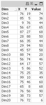
How to show values on bubbles in a scatter chart?
Accepted Solutions
- Mark as New
- Bookmark
- Subscribe
- Mute
- Subscribe to RSS Feed
- Permalink
- Report Inappropriate Content
Hi,
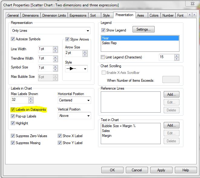
Please check the below option(Labels on data points) on presentation tab.
- Mark as New
- Bookmark
- Subscribe
- Mute
- Subscribe to RSS Feed
- Permalink
- Report Inappropriate Content
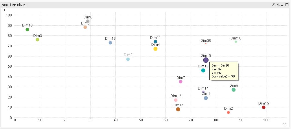
I don't think that's possible:
- Mark as New
- Bookmark
- Subscribe
- Mute
- Subscribe to RSS Feed
- Permalink
- Report Inappropriate Content
Hi,
can you specify your data, chart settings and expected values you want to present?
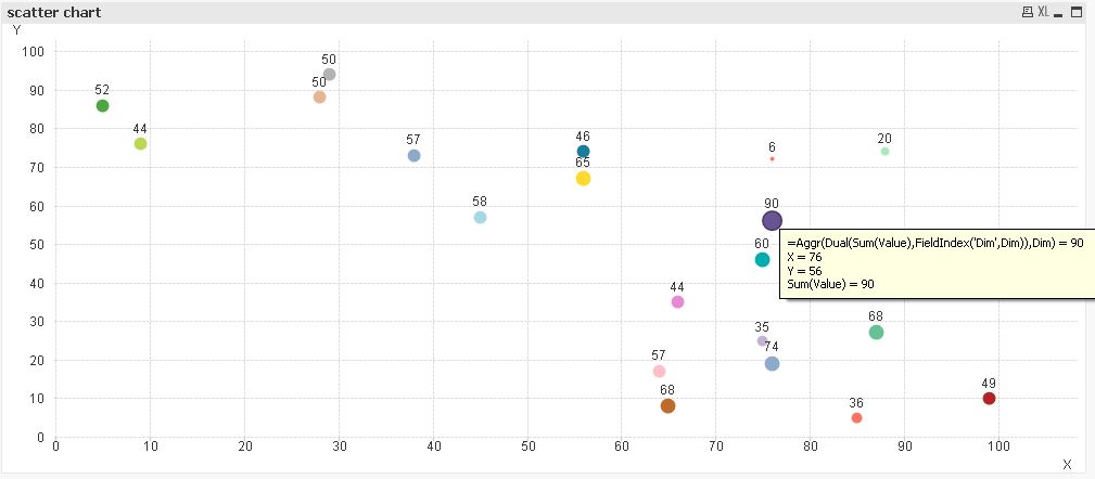
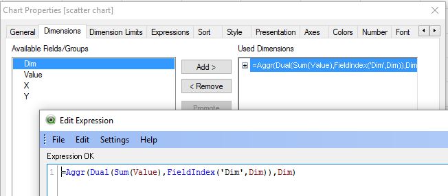
If there's no other option, maybe you can trick QlikView into presenting expression instead of dimension values as labels by replacing your dimension with some calculated dimension like:
hope this helps
regards
Marco
- Mark as New
- Bookmark
- Subscribe
- Mute
- Subscribe to RSS Feed
- Permalink
- Report Inappropriate Content
seems this method was already proposed in above linked post ...
- Mark as New
- Bookmark
- Subscribe
- Mute
- Subscribe to RSS Feed
- Permalink
- Report Inappropriate Content
Hi Suresh,
Chart Properties-> On the Number tab, select all expressions and set the Number Format
Settings option to Integer. Enter x 1 thousand in the Thousand Symbol
field, x 1 million in the Million Symbol field, and x 1 billion in the
Billion Symbol field.
Click on Finish to apply the settings and close the dialog.
Hope this will work
Thanks
Kesav
- Mark as New
- Bookmark
- Subscribe
- Mute
- Subscribe to RSS Feed
- Permalink
- Report Inappropriate Content
Hi,
Please check the below option(Labels on data points) on presentation tab.
- Mark as New
- Bookmark
- Subscribe
- Mute
- Subscribe to RSS Feed
- Permalink
- Report Inappropriate Content
Nevertheless, it's a fine illustration of a method that was only sparsely explained in the above mentioned discussion.
Nice!