Unlock a world of possibilities! Login now and discover the exclusive benefits awaiting you.
- Qlik Community
- :
- All Forums
- :
- QlikView App Dev
- :
- Re: Chart Average line value -> use it in other ch...
- Subscribe to RSS Feed
- Mark Topic as New
- Mark Topic as Read
- Float this Topic for Current User
- Bookmark
- Subscribe
- Mute
- Printer Friendly Page
- Mark as New
- Bookmark
- Subscribe
- Mute
- Subscribe to RSS Feed
- Permalink
- Report Inappropriate Content
Chart Average line value -> use it in other chart
UPDATE: I added sample:
load script loads excel file with date / value 1
this is shown in first chart: together with internal average line.
and i need to know this average value to use it in a second chart:
e.g. this second chart uses other values but those values need to be coloured if they are higher or lower than the average value of the first diagram ?
My question is: can we get this value within module scripts ?
hi,
how can I use a chart average (trend line) value in another diagramme ?
is there any possibility to read this average value (trend line) within a macro ? like Chart.properties and then the average value ?
I could not find any solution.
Thanks for your help.
- « Previous Replies
-
- 1
- 2
- Next Replies »
- Mark as New
- Bookmark
- Subscribe
- Mute
- Subscribe to RSS Feed
- Permalink
- Report Inappropriate Content
Would you be able to share an example of what you are trying to do? May be it is doable without a macro? Not really sure until we see more details
- Mark as New
- Bookmark
- Subscribe
- Mute
- Subscribe to RSS Feed
- Permalink
- Report Inappropriate Content
Am not sure if I totally understand the requirements.
Can you capture the average in an expression/variable? and use that as a "reference line" under Presentation tab of the chart properties?
- Mark as New
- Bookmark
- Subscribe
- Mute
- Subscribe to RSS Feed
- Permalink
- Report Inappropriate Content
added example data
- Mark as New
- Bookmark
- Subscribe
- Mute
- Subscribe to RSS Feed
- Permalink
- Report Inappropriate Content
Is this what you are looking for?
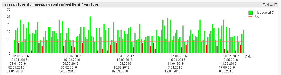
Where the avg line is created using this expression:
Avg(TOTAL Aggr(Sum([Messwert 1]), Datum))
and background color using this:
If(Column(1) > Column(2), LightGreen(), LightRed())
Where Column(1) is your expression for the bar [Messwert 2] and Column(2) is the Avg expression from above (Avg(TOTAL Aggr(Sum([Messwert 1]), Datum)))
- Mark as New
- Bookmark
- Subscribe
- Mute
- Subscribe to RSS Feed
- Permalink
- Report Inappropriate Content
thanks for your help.
however I have still one question about conditional coloring of the chart rows:
I know tha in diemnsion or expression I can use background coloring in an if expression.
BUT: I have 5 rows in a chart.
each row-value has to be compared to the value of a related variable.
so: field1 (of row1) compared to variable1, field2 (of row2) compared to variable2 ....
how is this possible:
with the expression RowNo and building nested if clauses ?
or which are the options,
thanks again
- Mark as New
- Bookmark
- Subscribe
- Mute
- Subscribe to RSS Feed
- Permalink
- Report Inappropriate Content
5 rows in a chart? I am not entirely sure I understand your question. Can you elaborate a little?
- Mark as New
- Bookmark
- Subscribe
- Mute
- Subscribe to RSS Feed
- Permalink
- Report Inappropriate Content
sorry 5 rows in a table box, not chart.
- Mark as New
- Bookmark
- Subscribe
- Mute
- Subscribe to RSS Feed
- Permalink
- Report Inappropriate Content
Can you provided an updated sample with the expected output?
- Mark as New
- Bookmark
- Subscribe
- Mute
- Subscribe to RSS Feed
- Permalink
- Report Inappropriate Content
i added a sample for this problem
- « Previous Replies
-
- 1
- 2
- Next Replies »