Unlock a world of possibilities! Login now and discover the exclusive benefits awaiting you.
- Qlik Community
- :
- All Forums
- :
- QlikView App Dev
- :
- Bubble chart
- Subscribe to RSS Feed
- Mark Topic as New
- Mark Topic as Read
- Float this Topic for Current User
- Bookmark
- Subscribe
- Mute
- Printer Friendly Page
- Mark as New
- Bookmark
- Subscribe
- Mute
- Subscribe to RSS Feed
- Permalink
- Report Inappropriate Content
Bubble chart
I have a Table that contains a few columns like this:
Column A : Date
Column B: Time
Column C: Network ID
Column 😧 Customer ID
Column E: Customer status
Column F: Time (in sec)
Column G: Region (Region A, B, C....etc.)
Column H:
Column E indicates the status of the customer, whether it is in network or out of network and column F tells how long it has been in or out of network.
Another table loaded also simply has columns
Column A: range
Column B: label
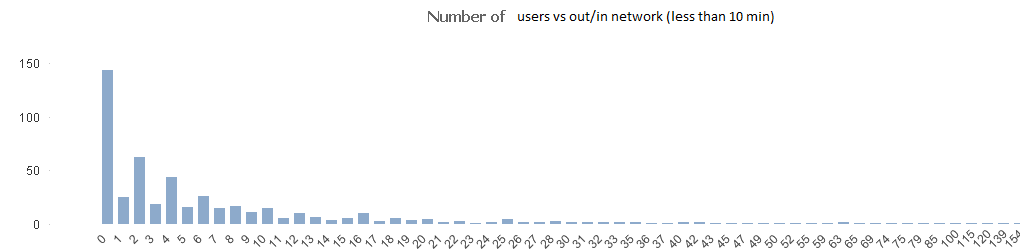
I was able to create a chart showing range that shows how many times customer in network for certain period (e.g. 10 minutes). This is by using range as dimension and expression as follows:
=sum(if(aggr(sum(if(([Time in sec]<60*10 and Customer_status='IN_NETWORK'), 1,0)),Customer_ID, Network_ID, Region, range)<=range and aggr(sum(if(([Time in sec]<60*10 and Customer_status='IN_NETWORK'), 1,0)),Customer_ID, Network_ID, Region, range)>range-1,1,0))
with a chart that I got like below:
Now I'd like to draw a bubble chart showing the quantity of in/out network experienced by each customer over period of time. I tried to use some combination available parameters but it seemed not working as I expected. No proper bubble chart is showing up with scatter plots.
Any suggestions how this should be done?