Unlock a world of possibilities! Login now and discover the exclusive benefits awaiting you.
- Qlik Community
- :
- All Forums
- :
- QlikView
- :
- Multiple reference lines in one statement
- Subscribe to RSS Feed
- Mark Topic as New
- Mark Topic as Read
- Float this Topic for Current User
- Bookmark
- Subscribe
- Mute
- Printer Friendly Page
- Mark as New
- Bookmark
- Subscribe
- Mute
- Subscribe to RSS Feed
- Permalink
- Report Inappropriate Content
Multiple reference lines in one statement
Hello Qlik.
I have a line chart with timestamps on the x-axis, and multiple sensor values as expressions.
I want to do vertical reference lines to clearly display the beginning of each day, and each week, in various colors.
I managed to do it by manually adding several reference lines such as:
WeekStart(Today(0))
DayStart(Today(0))
DayStart(Today(0)-1)
DayStart(Today(0)-2)
DayStart(Today(0)-3)
.. and so on.
But as we are gathering data continously, i want the view to be able to add these reference lines automaticly, even if i chose to view for example an entire month. It feels unreasonable that i should have to create 30 additional reference lines manually.
Is there a better way to do it?
Thank you all.
/Adam
Accepted Solutions
- Mark as New
- Bookmark
- Subscribe
- Mute
- Subscribe to RSS Feed
- Permalink
- Report Inappropriate Content
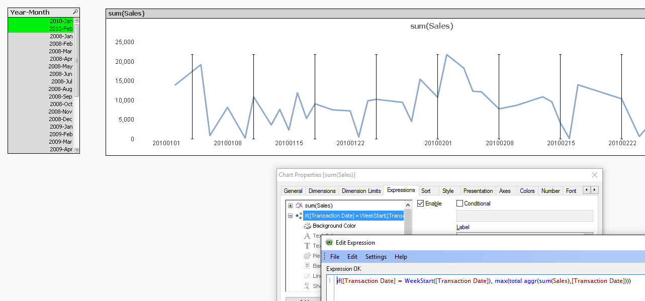
Try a combi chart with an extra expression that returns a value only for the x-axis values where you want a line. The value should be equal to or a bit bigger than the maximum value that your other expression returns. Perhaps something like max(aggr( your_expression , x-axis-dimension-here)) can calculate that value
You can use Symbol as representation type. Check the Has Error Bars option. Then click on the + in front of the expression. Use the same expression formula for the Error Below option and use a very small non-zero value like 0.001 for the Error Above option. And set the Background Color option for the symbol to argb(0,0,0,0) to make the symbol itself totally transparent.
In the image below I've use a field called Transaction Data for the x-axis and put a line on every week start date
talk is cheap, supply exceeds demand
- Mark as New
- Bookmark
- Subscribe
- Mute
- Subscribe to RSS Feed
- Permalink
- Report Inappropriate Content
Thank you!
I think this might be the best solution.
At first, it seemed the if statement if([DateTime]) = DayStart([DateTime] returned false for every statement.
I think it could be because my timestamps are not necessarily rounded to the nearest even minute, so i dont have any entry corresponding to 00:00. I changed the statement to
if([DateTime]) < DayStart([DateTime)] + 0.001 and [DateTime] > DayStart([DateTime)] -0.001, 65,0)
This works quite well, but it seems the bars can have slightly varied width. Any ideas to solve that?
Also, i managed to change the error bars to red color, but would it be possible to have an additional expression with green error bars (I want that for the start of each week).
/Adam