Unlock a world of possibilities! Login now and discover the exclusive benefits awaiting you.

- Qlik Community
- :
- All Forums
- :
- QlikView
- :
- how to create a net risk map?
- Subscribe to RSS Feed
- Mark Topic as New
- Mark Topic as Read
- Float this Topic for Current User
- Bookmark
- Subscribe
- Mute
- Printer Friendly Page

 jim_chan
- Mark as New
- Bookmark
- Subscribe
- Mute
- Subscribe to RSS Feed
- Permalink
- Report Inappropriate Content
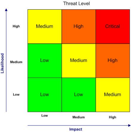
how to create a net risk map?
hi guys,.
Has anyone see this kind of net risk map in qlikview b4? anyone created table as such ???
i neeed samples. anyone?
Anyway, many months ago, i found out that there's a post regarding this, and i have attached the qvw file created by the contributor.
but problem is... how do it put Impact at the X axis and Likelihood at the Y axis?
thanks,
Jim

 swuehl
- Mark as New
- Bookmark
- Subscribe
- Mute
- Subscribe to RSS Feed
- Permalink
- Report Inappropriate Content
Isn't this already done in your sample QVW nicely?
Just create a pivot table and pivot impact dimension to the top.
A similar chart could maybe also created using a grid chart.
 punitpopli
- Mark as New
- Bookmark
- Subscribe
- Mute
- Subscribe to RSS Feed
- Permalink
- Report Inappropriate Content
jim_chan
- Mark as New
- Bookmark
- Subscribe
- Mute
- Subscribe to RSS Feed
- Permalink
- Report Inappropriate Content
Nope.
based on the sample qvw given, cant really with the interface as per my screenshot...



- Mark as New
- Bookmark
- Subscribe
- Mute
- Subscribe to RSS Feed
- Permalink
- Report Inappropriate Content
If you want same axis then might be we need to add line object and text object for them
jim_chan
- Mark as New
- Bookmark
- Subscribe
- Mute
- Subscribe to RSS Feed
- Permalink
- Report Inappropriate Content
i only can think about text object. but, how to hide the work impact and likelihood? erase and leave space?
 adamdavi3s
- Mark as New
- Bookmark
- Subscribe
- Mute
- Subscribe to RSS Feed
- Permalink
- Report Inappropriate Content
Yes I would just put a space in which will blank them out, and then use text / line objects to add the axis manually
