Unlock a world of possibilities! Login now and discover the exclusive benefits awaiting you.
- Qlik Community
- :
- Forums
- :
- Analytics & AI
- :
- Products & Topics
- :
- Visualization and Usability
- :
- Re: a problem about sense storytelling and snapsho...
- Subscribe to RSS Feed
- Mark Topic as New
- Mark Topic as Read
- Float this Topic for Current User
- Bookmark
- Subscribe
- Mute
- Printer Friendly Page
- Mark as New
- Bookmark
- Subscribe
- Mute
- Subscribe to RSS Feed
- Permalink
- Report Inappropriate Content
a problem about sense storytelling and snapshot
Hi everyone,
When I create a storytelling in the sense, if I choose a snapshot, then the data in the snapshot can not be modified. Eg, as the picture shows:
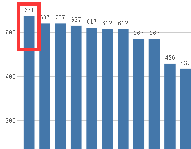
When I take a snapshot for the chart, and I insert it into my storytelling.
But my requirement is : when I export the PPT or PDF, I hope the data is able to adjust. For example, I want the number 671 to become the 670 in the PPT I exported. Of course, I can not modify the data source and model,just become 670 in my PPT, adjust it by hand.
Or another idea?
Thanks.
- « Previous Replies
-
- 1
- 2
- Next Replies »
- Mark as New
- Bookmark
- Subscribe
- Mute
- Subscribe to RSS Feed
- Permalink
- Report Inappropriate Content
And that's a problem? Well, put a text object in front of it..
- Mark as New
- Bookmark
- Subscribe
- Mute
- Subscribe to RSS Feed
- Permalink
- Report Inappropriate Content
I think about it. But if the chart has many places to modify, it is difficlut to adjust,another problem is the overcovered data can not be removed and the size is difficult to adjust. what is more, the experience for my customer is not good. So I want a better idea, thanks.
- Mark as New
- Bookmark
- Subscribe
- Mute
- Subscribe to RSS Feed
- Permalink
- Report Inappropriate Content
You should not be manually modifying data after you print your documents!
Correct them in the data source instead or introduce a governed and streamlined way of posting adjustments.
- Mark as New
- Bookmark
- Subscribe
- Mute
- Subscribe to RSS Feed
- Permalink
- Report Inappropriate Content
Thanks, my customer do not allow us to modify the source date and they also do not know how to modify. They want to adjust the data when generated the PPT according to their experience and then send the PPT report to their lead. Because they paid the money for the data from other company, maybe the data is not corrent, so my customer needs to adjust the data when report to their lead according to their experience. Could you give me some advice?
- Mark as New
- Bookmark
- Subscribe
- Mute
- Subscribe to RSS Feed
- Permalink
- Report Inappropriate Content
Then you need to put an adjustment process in place which loads both the original data and the adjustments in Qlik Sense and corrects your numbers in the charts by aggregation both up - absolutely no manual adjustments on PPT slides. No-go!
- Mark as New
- Bookmark
- Subscribe
- Mute
- Subscribe to RSS Feed
- Permalink
- Report Inappropriate Content
Thanks, maybe this way is not useful. Maybe I should change my mind.Thanks very much for answering!
- Mark as New
- Bookmark
- Subscribe
- Mute
- Subscribe to RSS Feed
- Permalink
- Report Inappropriate Content
if your users requirement is to massage the figures on a governed data generated report then a little red warning light should be going off in your head.
As the guys have already suggested any adjustment of results must be contained in the app itself even if its a source file you include manually, preferably with a reason for the adjustment to include in your reports/stories.
Regards
Andy
- Mark as New
- Bookmark
- Subscribe
- Mute
- Subscribe to RSS Feed
- Permalink
- Report Inappropriate Content
If you insert the sheet into your story instead of a snapshot then you can modify the presentation by modifying the QS app. A snapshot is just that. It is an image of what was there at the time you took it.
- Mark as New
- Bookmark
- Subscribe
- Mute
- Subscribe to RSS Feed
- Permalink
- Report Inappropriate Content
Thanks.If the sheet can solve my problem, that's OK. But I try it, I found it is still a picture when I export it into PPT, I can not modify it. Or my operation is wrong?
- « Previous Replies
-
- 1
- 2
- Next Replies »