Unlock a world of possibilities! Login now and discover the exclusive benefits awaiting you.
- Qlik Community
- :
- All Forums
- :
- QlikView App Dev
- :
- Re: Cummulative/Rolling Sum needed for chart (Does...
- Subscribe to RSS Feed
- Mark Topic as New
- Mark Topic as Read
- Float this Topic for Current User
- Bookmark
- Subscribe
- Mute
- Printer Friendly Page
- Mark as New
- Bookmark
- Subscribe
- Mute
- Subscribe to RSS Feed
- Permalink
- Report Inappropriate Content
Cummulative/Rolling Sum needed for chart (Doesnt work with Full Accumulation Option)
Hi Everyone,
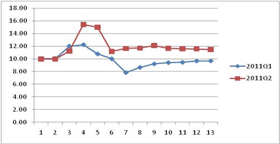
I am a new to Qlikview and hopefully someone can help me with solution/suggestion for the issue below ( also shown in attachment )
I would need a rolling sum for each week in the qtr ( W1 to W13 of 2011Q1 and 2011Q2 ) to get Cummlative Amount and Cummulative Units. Then rate column would be a simple division between the 2 columns which is what I need to chart finally. What I finally need is the chart ( as shown below after the table) but I am also showing the below straight table representation of the chart data. If I can get the any one of the below outputs that would be great. Please let me know if you need more explanation.
| WeekInQtr | YearQuarter | Amount | Cumm Amount | Units | Cumm Units | Rate=Cumm Amount/Cumm Rate |
| 1 | 2011Q1 | 10 | 10 | 1 | 1 | 10.0 |
| 1 | 2011Q2 | 20 | 20 | 2 | 2 | 10.0 |
| 2 | 2011Q1 | 10 | 20 | 1 | 2 | 10.0 |
| 2 | 2011Q2 | 20 | 40 | 2 | 4 | 10.0 |
| 3 | 2011Q1 | 40 | 60 | 3 | 5 | 12.0 |
| 3 | 2011Q2 | 50 | 90 | 4 | 8 | 11.3 |
| 4 | 2011Q1 | 50 | 110 | 4 | 9 | 12.2 |
| 4 | 2011Q2 | 80 | 170 | 3 | 11 | 15.5 |
| 5 | 2011Q1 | 30 | 140 | 4 | 13 | 10.8 |
| 5 | 2011Q2 | 10 | 180 | 1 | 12 | 15.0 |
| 6 | 2011Q1 | 30 | 170 | 4 | 17 | 10.0 |
| 6 | 2011Q2 | 10 | 190 | 5 | 17 | 11.2 |
| 7 | 2011Q1 | 10 | 180 | 6 | 23 | 7.8 |
| 7 | 2011Q2 | 90 | 280 | 7 | 24 | 11.7 |
| 8 | 2011Q1 | 45 | 225 | 3 | 26 | 8.7 |
| 8 | 2011Q2 | 25 | 305 | 2 | 26 | 11.7 |
| 9 | 2011Q1 | 60 | 285 | 5 | 31 | 9.2 |
| 9 | 2011Q2 | 95 | 400 | 7 | 33 | 12.1 |
| 10 | 2011Q1 | 25 | 310 | 2 | 33 | 9.4 |
| 10 | 2011Q2 | 45 | 445 | 5 | 38 | 11.7 |
| 11 | 2011Q1 | 30 | 340 | 3 | 36 | 9.4 |
| 11 | 2011Q2 | 90 | 535 | 8 | 46 | 11.6 |
| 12 | 2011Q1 | 85 | 425 | 8 | 44 | 9.7 |
| 12 | 2011Q2 | 10 | 545 | 1 | 47 | 11.6 |
| 13 | 2011Q1 | 10 | 435 | 1 | 45 | 9.7 |
| 13 | 2011Q2 | 20 | 565 | 2 | 49 | 11.5 |
- Tags:
- new_to_qlikview
Accepted Solutions
- Mark as New
- Bookmark
- Subscribe
- Mute
- Subscribe to RSS Feed
- Permalink
- Report Inappropriate Content
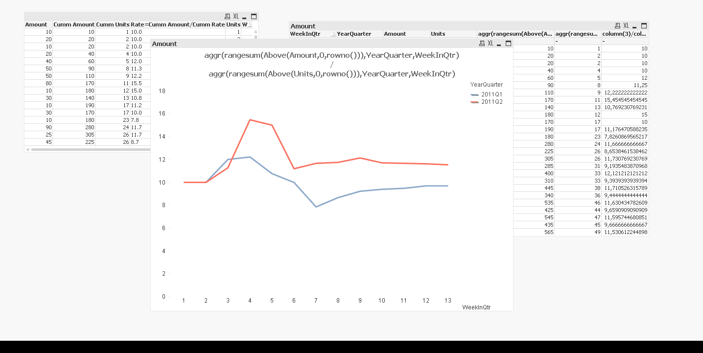
Hi,
I think you need an advanced aggregation to get your desired results here.
Please look at attached sample and / or screenshot.
Regards,
Stefan
- Mark as New
- Bookmark
- Subscribe
- Mute
- Subscribe to RSS Feed
- Permalink
- Report Inappropriate Content
Hi,
See the attached sample file you have to make a chart some thing like this with line chart graph.
HTH
Rgds
Anand
- Mark as New
- Bookmark
- Subscribe
- Mute
- Subscribe to RSS Feed
- Permalink
- Report Inappropriate Content
Hi Anand,
Thanks for your reply.
Actually the problem I have is to know how to get the Cummulative Amount and Cummulative Units columns as shown above assuming we have WeekInQtr, YearQuarter, Amount and Units.
- Mark as New
- Bookmark
- Subscribe
- Mute
- Subscribe to RSS Feed
- Permalink
- Report Inappropriate Content
Hi,
Use some thing like in the Solution sheet.
Rgds
Anand
- Mark as New
- Bookmark
- Subscribe
- Mute
- Subscribe to RSS Feed
- Permalink
- Report Inappropriate Content
Hi Anand,
The straight table should always be grouped by week and then quarter...for the chart to show the right cummulation numbers. Unfortunately the solution you provided doesnt work when I chart the straight table.
| WeekInQtr | YearQuarter | Amount | Cumm Amount | Units | Cumm Units | Rate=Cumm Amount/Cumm Rate |
| 1 | 2011Q1 | 10 | 10 | 1 | 1 | 10.0 |
| 1 | 2011Q2 | 20 | 20 | 2 | 2 | 10.0 |
| 2 | 2011Q1 | 10 | 20 | 1 | 2 | 10.0 |
| 2 | 2011Q2 | 20 | 40 | 2 | 4 | 10.0 |
- Mark as New
- Bookmark
- Subscribe
- Mute
- Subscribe to RSS Feed
- Permalink
- Report Inappropriate Content
try this
RangeSum(Above(Sum([Cumm Amount]), 0, RowNo()))
/
RangeSum(Above(Sum([Cumm Rate]), 0, RowNo()))
hope this helps
check weither proper name Cumm amount and Cumm rate
- Mark as New
- Bookmark
- Subscribe
- Mute
- Subscribe to RSS Feed
- Permalink
- Report Inappropriate Content
Hi Sunil, this doesnt work  .. I dont get the result I need.. thanks for your reply though
- Mark as New
- Bookmark
- Subscribe
- Mute
- Subscribe to RSS Feed
- Permalink
- Report Inappropriate Content
Hi,
I think you need an advanced aggregation to get your desired results here.
Please look at attached sample and / or screenshot.
Regards,
Stefan
- Mark as New
- Bookmark
- Subscribe
- Mute
- Subscribe to RSS Feed
- Permalink
- Report Inappropriate Content
Hi,
Please see the attached file to do this in the script level
- Mark as New
- Bookmark
- Subscribe
- Mute
- Subscribe to RSS Feed
- Permalink
- Report Inappropriate Content
Hi Stefan,
You are the Qlikview Guru 
That solution worked for me... thanks a ton. Have a nice weekend.
Thank you Qliksus.. you have a nice weekend
Thanks