Unlock a world of possibilities! Login now and discover the exclusive benefits awaiting you.
- Qlik Community
- :
- All Forums
- :
- QlikView App Dev
- :
- Values on data points are cut off when "log scales...
- Subscribe to RSS Feed
- Mark Topic as New
- Mark Topic as Read
- Float this Topic for Current User
- Bookmark
- Subscribe
- Mute
- Printer Friendly Page
- Mark as New
- Bookmark
- Subscribe
- Mute
- Subscribe to RSS Feed
- Permalink
- Report Inappropriate Content
Values on data points are cut off when "log scales" enabled
Hello everybody
I have got a problem designing a bar chart at the QlikView Developer 9 SR7.
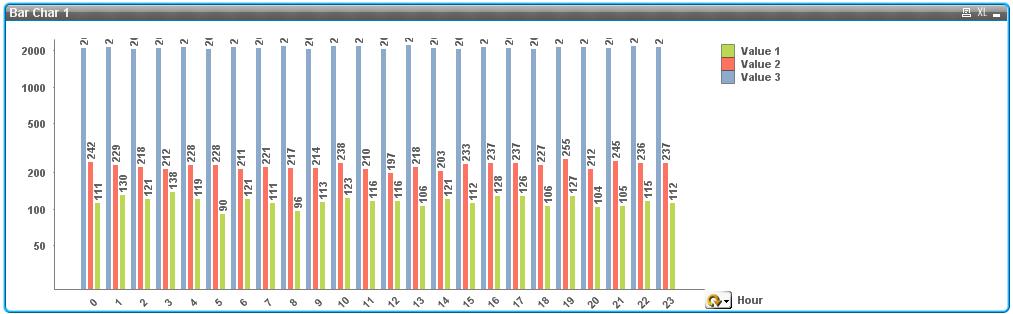
I want to scale the Y-axis logarithmic, but when I enable the option "log scales", the values on the bars are cut off somehow (see picture below)
They are shown correct, when "log scales" is disabled.
Does anybody have a solution for this issue?
Thanks in advance!
Kind regards
Sebastian
- Mark as New
- Bookmark
- Subscribe
- Mute
- Subscribe to RSS Feed
- Permalink
- Report Inappropriate Content
Its not entirely clear from the picture what your problem is.
I have just done a test with a mixture of log and normal scales which appears to work.
Have you checked that you not entered a static maximum on the scales - but have left the scales to be calculated automatically ?
Or, it might be interesting to force a static max at a value higher than any you'd expect?
Regards
- Mark as New
- Bookmark
- Subscribe
- Mute
- Subscribe to RSS Feed
- Permalink
- Report Inappropriate Content
Thanks for your answer.
I have not set a static maximum, as it is possible to switch between hourly / minutley / daily / etc view, so the maximum value varies (while you have a maximum value of 2100 at hourly view, the maximum of view "minute per day" is 60. So it would not be a satisfying solution to set the static max to 2100, because you would not see anything at the "minute per day" view).
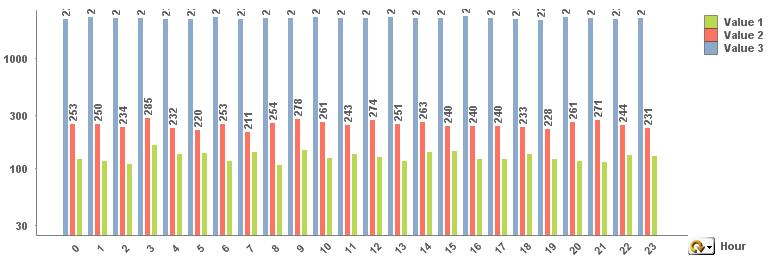
I have attached two more screenshots. Hopefully they will show my problem more cleary.
No "log scales" (everything fine with values on bars):
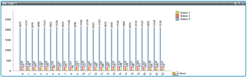
"Log scales" activated (values on bars are not shown correctly):
Thanks in advance!
- Mark as New
- Bookmark
- Subscribe
- Mute
- Subscribe to RSS Feed
- Permalink
- Report Inappropriate Content
Hi
Yes, I see the problem. It does seem that when QlikView works out the layout for a chart, it sometimes gets it wrong ! I have 3 ideas for you:
1) Are you able to make your chart object bigger along the y-axis? I understand this may spoil your design, but it may be worth checking to see if this helps.
2) Try a different style for the bar chart - some work better than others
3) Use a static maximum, but make it an expression such as IF(hourly,2200,65)
Hope that helps.
Regards
- Mark as New
- Bookmark
- Subscribe
- Mute
- Subscribe to RSS Feed
- Permalink
- Report Inappropriate Content
...I have a 4th idea if you are using version 10 ?
You can use a container object to house 2 or more separate charts, although only one is shown at a time, according to the tab you select. So you would be able to have a Day chart with static max, Hourly chart, with static max etc.