Unlock a world of possibilities! Login now and discover the exclusive benefits awaiting you.
- Qlik Community
- :
- All Forums
- :
- QlikView App Dev
- :
- minichart bars spacing issue
- Subscribe to RSS Feed
- Mark Topic as New
- Mark Topic as Read
- Float this Topic for Current User
- Bookmark
- Subscribe
- Mute
- Printer Friendly Page
- Mark as New
- Bookmark
- Subscribe
- Mute
- Subscribe to RSS Feed
- Permalink
- Report Inappropriate Content
minichart bars spacing issue
Hi,
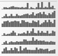
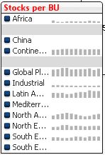
My minichart shows the stock balance by region, over a period of 12 months
The result looks like this :

There's too much spacing between the bars, how can I tight this up, into a nice bar chart like this?
I cannot find it in the settings.
Thanks
- Mark as New
- Bookmark
- Subscribe
- Mute
- Subscribe to RSS Feed
- Permalink
- Report Inappropriate Content
just make the width of the column smaller
- Mark as New
- Bookmark
- Subscribe
- Mute
- Subscribe to RSS Feed
- Permalink
- Report Inappropriate Content
You only have to resize your chart or list box.
don't have extra space in the chart. Make it compact.
your Problem will be sort it out.
Regards,
Nitin Jain
- Mark as New
- Bookmark
- Subscribe
- Mute
- Subscribe to RSS Feed
- Permalink
- Report Inappropriate Content
well, I was not complete,
I know that when I just squeeze the dimensions, the bars become better, but the probelem is that I cannot read my text anymore, so in fact, only the bars should be squeezed while the text part stays fixed.
- Mark as New
- Bookmark
- Subscribe
- Mute
- Subscribe to RSS Feed
- Permalink
- Report Inappropriate Content
Is it the List Box or some chart ? ?
Suppose if it the chart then b/w two column ther is "+". Just Click on it and then squeeze it Accordingly
Regards,
Nitin Jain
- Mark as New
- Bookmark
- Subscribe
- Mute
- Subscribe to RSS Feed
- Permalink
- Report Inappropriate Content
Yes it's a list box with mini chart.
There should be some way to make it fixed, no?
- Mark as New
- Bookmark
- Subscribe
- Mute
- Subscribe to RSS Feed
- Permalink
- Report Inappropriate Content
It is the same as I have suggested you even in the list box .
Please find the attachement.
Regards,
Nitin Jain
- Mark as New
- Bookmark
- Subscribe
- Mute
- Subscribe to RSS Feed
- Permalink
- Report Inappropriate Content
Nice sample app, thanks!