Unlock a world of possibilities! Login now and discover the exclusive benefits awaiting you.
- Qlik Community
- :
- All Forums
- :
- QlikView App Dev
- :
- Re: line chart no dimensions
- Subscribe to RSS Feed
- Mark Topic as New
- Mark Topic as Read
- Float this Topic for Current User
- Bookmark
- Subscribe
- Mute
- Printer Friendly Page
- Mark as New
- Bookmark
- Subscribe
- Mute
- Subscribe to RSS Feed
- Permalink
- Report Inappropriate Content
line chart no dimensions
I have created a bar chart with 20 expressions and no dimensions. These expressions calculated the current age of people in a specified category's and the future when by using a slider. So you can see what the number of each category is about eg 10 years.
It works correctly.
Now I want to convert the bar chart into a line chart and but I dont receive the expected result. No line visible only numbers below each other.
Does anybody know if and how to solve this ?
Thanks
.
- Tags:
- new_to_qlikview
- « Previous Replies
-
- 1
- 2
- Next Replies »
Accepted Solutions
- Mark as New
- Bookmark
- Subscribe
- Mute
- Subscribe to RSS Feed
- Permalink
- Report Inappropriate Content
Please, mark the correct answer to complete the topic, so that other people could easely read it.
- Mark as New
- Bookmark
- Subscribe
- Mute
- Subscribe to RSS Feed
- Permalink
- Report Inappropriate Content
Hi,
Bar chart is for comparision and can be done by more than any no.of metrics with or without a dimension. Line chart is for trending which suggest how a metric(s) move over time (usuall time is the dimension but not necessarily). Hence the behaviour, in your case is expected. In line chart one expression will only have one line unlike bar graph. Propably if you want to share the intended interpertation of the graph alternatives can be suggested in this forum.
Kiran.
- Mark as New
- Bookmark
- Subscribe
- Mute
- Subscribe to RSS Feed
- Permalink
- Report Inappropriate Content
Thanks Kiran,
Below you find my current chart.
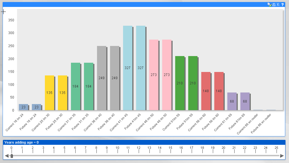
Below the situation when counting 10 years at the current age.
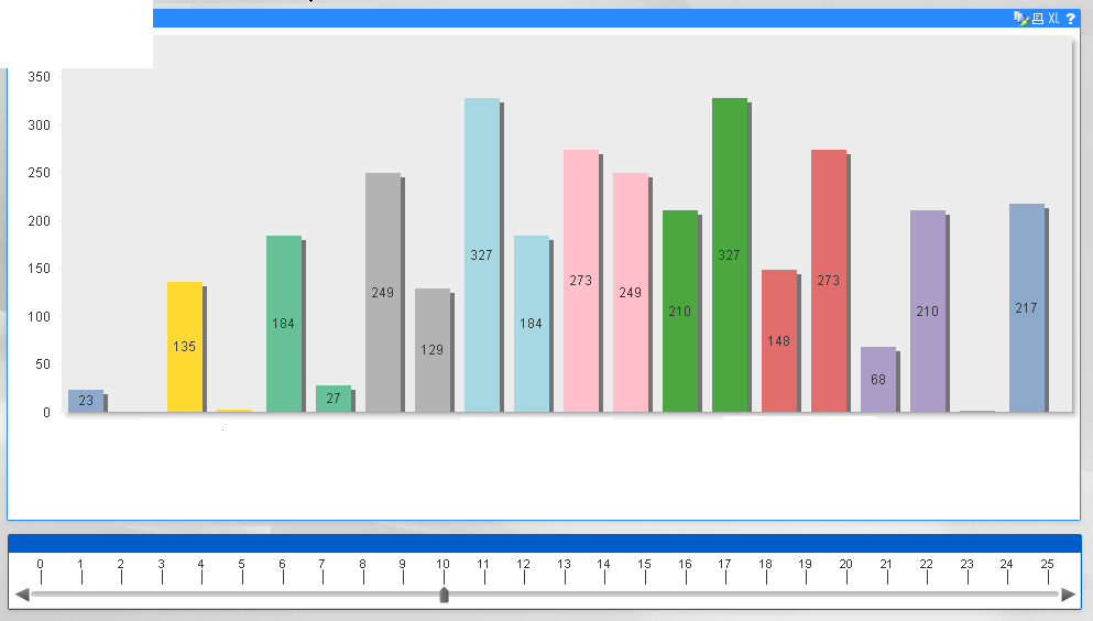
I am not satisfied about the layout. There is so much to see and I dont think it's really clear. So thats why I wanted to use a line chart.
Do you know if it is possible that starting at 0 only the current bars shown and adding years the new situation appears ?
Or when you have others ideas......:)
Nancy
- Mark as New
- Bookmark
- Subscribe
- Mute
- Subscribe to RSS Feed
- Permalink
- Report Inappropriate Content
Yes, we can hide expressions based on a condition. If you are using QV 11 you can add a condition to expression and enable if its so.
In this case i think we can manage with one expression by adding a dimension (i guess each expression is same except for some minute difference). Create an inline load with values as in the slider and appropiate discription. Make expression such that the values computed based on the dimensional value and limit the number of visible rows to variable number.
Regards,
Kiran.
- Mark as New
- Bookmark
- Subscribe
- Mute
- Subscribe to RSS Feed
- Permalink
- Report Inappropriate Content
Thanks Kiran and sorry for disturbing again.
I am using QV 10 since 6 weeks so not really experienced.
Can you give me more details how to solve ?
You are right the expressions are rather equal.
eg current 16-24
=sum(if(( age(MakeDate(Year(Now(1)), 12,31),Medewerker.DATEOFBIRTH)) <=24, Medewerker.Headcount))
future 16-24
=sum(if(( age(MakeDate(Year(Now(1)), 12,31),Medewerker.DATEOFBIRTH)+vAddToLeeftijd) <=24,
Medewerker.Headcount))
etc for the other catagorys
Thanks
- Mark as New
- Bookmark
- Subscribe
- Mute
- Subscribe to RSS Feed
- Permalink
- Report Inappropriate Content
Can you share a sample of your application?
Kiran.
- Mark as New
- Bookmark
- Subscribe
- Mute
- Subscribe to RSS Feed
- Permalink
- Report Inappropriate Content
Hi,
I created a new one just as example.
Thanks you so much for helping, would really be great if you can solve the problem !!
- Mark as New
- Bookmark
- Subscribe
- Mute
- Subscribe to RSS Feed
- Permalink
- Report Inappropriate Content
To use line chart you shoud convert your calculation model into something like this:
Try to create chart with
Dimension =class(age(MakeDate(Year(Now(1)), 12,31),Medewerker.GEBOORTEDATUM), 5)
and
Expression =sum(Medewerker.Headcount)
But there is a problem. Your goal is to overlap actually two different dimensions (one with offset) of data Medewerker.Headcount.
upd:
Next step.
Complex Solution
To merge that dimensions dynamicly let field "Expression":
LOAD * INLINE [
Expression
Current
Future
];
Change the dimension formula:
=class(age(MakeDate(Year(Now(1)), 12,31),Medewerker.GEBOORTEDATUM) + if(Expression='Future', vAddToLeeftijd, 0), 5, 'x', 0)
Add the field "Expression" as dimension (lower than previous one).
That's all. You have one data set Medewerker.Headcount over two dynamic dimensions.
To make it better you can use different line colors according to "Expression" field value.
Easy solution
If the offset of movement always equals to the dimension step (5 years in my example) you can just add expression for "Future"
=above(sum(Medewerker.Headcount), offset)
- Mark as New
- Bookmark
- Subscribe
- Mute
- Subscribe to RSS Feed
- Permalink
- Report Inappropriate Content
thanks are trying already but fear I am not able to solve this.
- Mark as New
- Bookmark
- Subscribe
- Mute
- Subscribe to RSS Feed
- Permalink
- Report Inappropriate Content
Check. I've updated it.
There are two possible solutions.
- « Previous Replies
-
- 1
- 2
- Next Replies »