Unlock a world of possibilities! Login now and discover the exclusive benefits awaiting you.
- Qlik Community
- :
- All Forums
- :
- QlikView App Dev
- :
- Re: Static Min and Static Max
- Subscribe to RSS Feed
- Mark Topic as New
- Mark Topic as Read
- Float this Topic for Current User
- Bookmark
- Subscribe
- Mute
- Printer Friendly Page
- Mark as New
- Bookmark
- Subscribe
- Mute
- Subscribe to RSS Feed
- Permalink
- Report Inappropriate Content
Static Min and Static Max
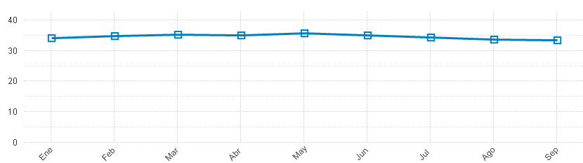
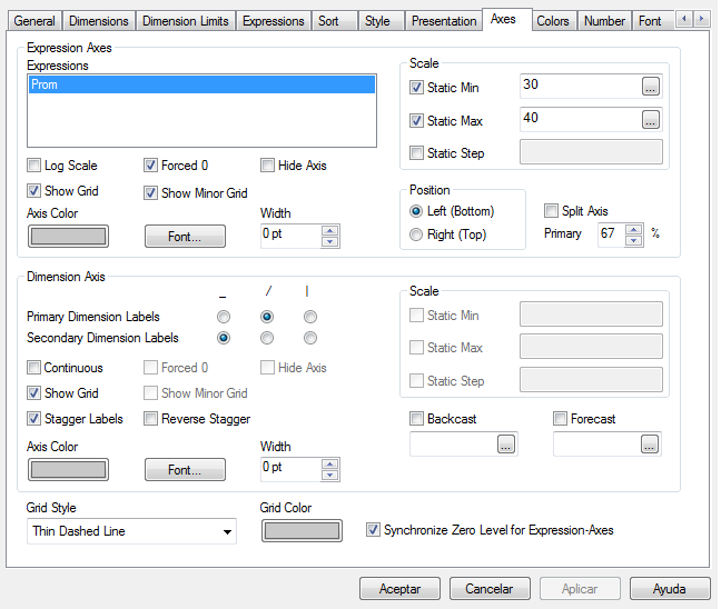
Hello, QlikView Gurus. Currently I'm working on a couple of charts. Most of them have very similar values, ranking between 32 and 40 (Using month as a dimension). As you can see, is a very small range. When the chart is visualizated, you can't see a real diference between the quantities, because the Y axis minimal numer is 0, and the max number is 40. Im trying to find a way where the minimal value of the Y axis is reduced to (at least) 30. With the Y axis range from 30 to 40, you can see easily the diferences between the quantities. Supposedly, the Static Min and the Static Max values (On the Properties/Axis tab) do the trick, but the Static Min isn't working for me. When I change the Static Max, it works, but with the Static Min there's no change to the chart.
Static Min is intended to work this way, or I'm doing it wrong? Is there any other way to change the Y axis ranges (Min and Max)?
I'm attaching an image of the chart, and my Axis tab.
Thanks in advance!!!!
Accepted Solutions
- Mark as New
- Bookmark
- Subscribe
- Mute
- Subscribe to RSS Feed
- Permalink
- Report Inappropriate Content
- Mark as New
- Bookmark
- Subscribe
- Mute
- Subscribe to RSS Feed
- Permalink
- Report Inappropriate Content
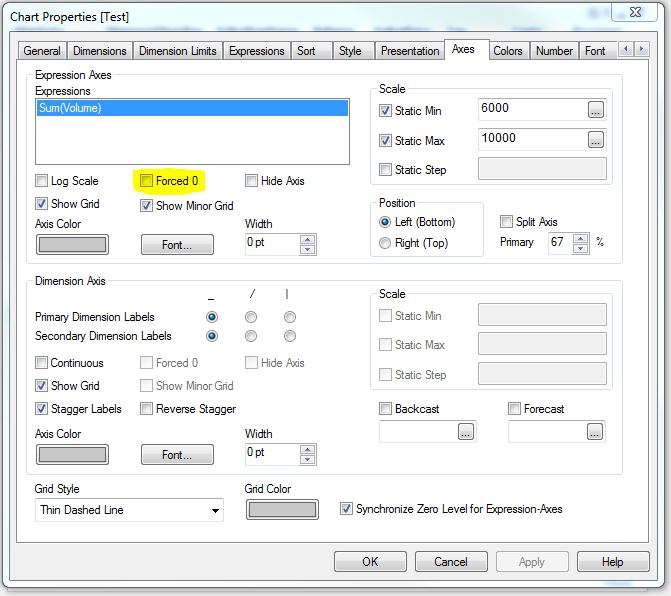
On Chart Properties>Axes>Deselect 'Forced 0':
- Mark as New
- Bookmark
- Subscribe
- Mute
- Subscribe to RSS Feed
- Permalink
- Report Inappropriate Content
Thanks rebeccad, it worked wonders  !!
!!