Unlock a world of possibilities! Login now and discover the exclusive benefits awaiting you.
- Qlik Community
- :
- All Forums
- :
- QlikView App Dev
- :
- Re: Filling in line chart
- Subscribe to RSS Feed
- Mark Topic as New
- Mark Topic as Read
- Float this Topic for Current User
- Bookmark
- Subscribe
- Mute
- Printer Friendly Page
- Mark as New
- Bookmark
- Subscribe
- Mute
- Subscribe to RSS Feed
- Permalink
- Report Inappropriate Content
Filling in line chart
Hi Everybody - hope you can help.
Using some mock up data I am trying to produce a particular type of line chart. I have set up the chart so the data is correct and accumulations etc. are ok so I've almost replicated it - what I'm looking to do is find some way of "colouring" the segments/gaps that the line graph is creating. The two illustrations below should explain what I mean properly.
This is the CURRENT chart I have produced:
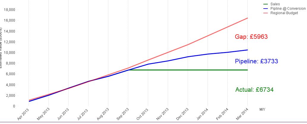
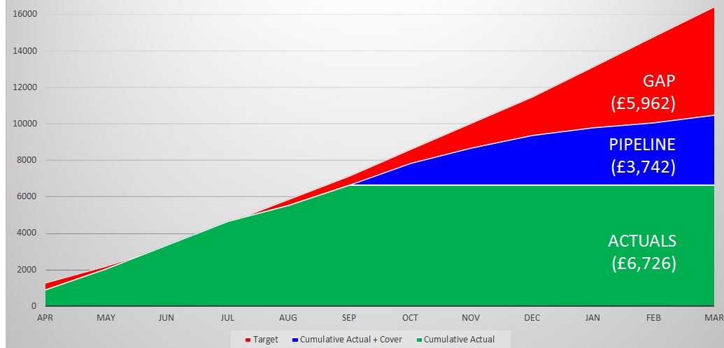
And this is the DESIRED one - I need it to look like this - note all it is effectively colouring in the gaps - is this possible?
Thanks in advance for any help.
Stu
Accepted Solutions
- Mark as New
- Bookmark
- Subscribe
- Mute
- Subscribe to RSS Feed
- Permalink
- Report Inappropriate Content
Hi Folks - the penny has dropped - the expressions need some if statements to deal with negative values (i.e. You sales beats budgets so gap is negative). Correct Test App is attached for future reference.
Thanks to everybody for their help couldn't have done it without you.
Cheers
Stu
- Mark as New
- Bookmark
- Subscribe
- Mute
- Subscribe to RSS Feed
- Permalink
- Report Inappropriate Content
Goto the 'Style' tab of the chart and try with the second last option of 'Look' panel
- Mark as New
- Bookmark
- Subscribe
- Mute
- Subscribe to RSS Feed
- Permalink
- Report Inappropriate Content
Hi tresesco
How I've missed that option I'll never know - I thought I'd checked everything - thanks a million pal!
Stu
- Mark as New
- Bookmark
- Subscribe
- Mute
- Subscribe to RSS Feed
- Permalink
- Report Inappropriate Content
Hi Stuart,
Let's not repent for that, rather enjoy that you know it now! 
- Mark as New
- Bookmark
- Subscribe
- Mute
- Subscribe to RSS Feed
- Permalink
- Report Inappropriate Content
I have actually just noticed something odd actually, when I do change the "look" of the chart in the style menu, the data is no longer correct - all the expressions are accumulated but why would the values change just because I've changed the style? Again - screenshots attached...
Line Graph:
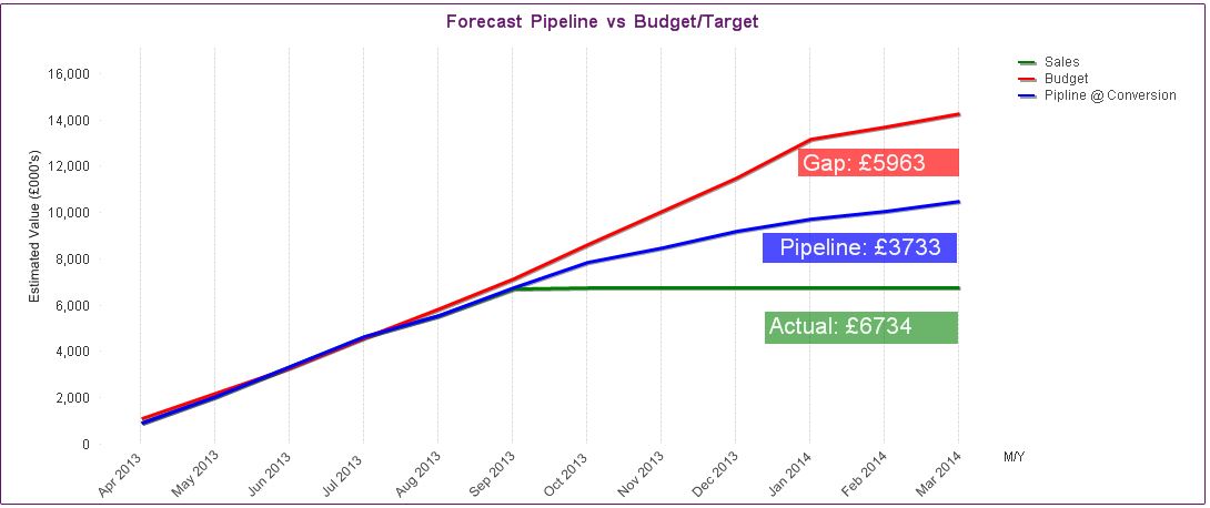
Style > Change Look (expressions not changed)
It appears to be the red area/line that's wrong. If I hover over it shows the correct values but they do not relate to the axis... puzzled!
THanks again
Stu
- Mark as New
- Bookmark
- Subscribe
- Mute
- Subscribe to RSS Feed
- Permalink
- Report Inappropriate Content
Can you share the App and we can have a look?
- Mark as New
- Bookmark
- Subscribe
- Mute
- Subscribe to RSS Feed
- Permalink
- Report Inappropriate Content
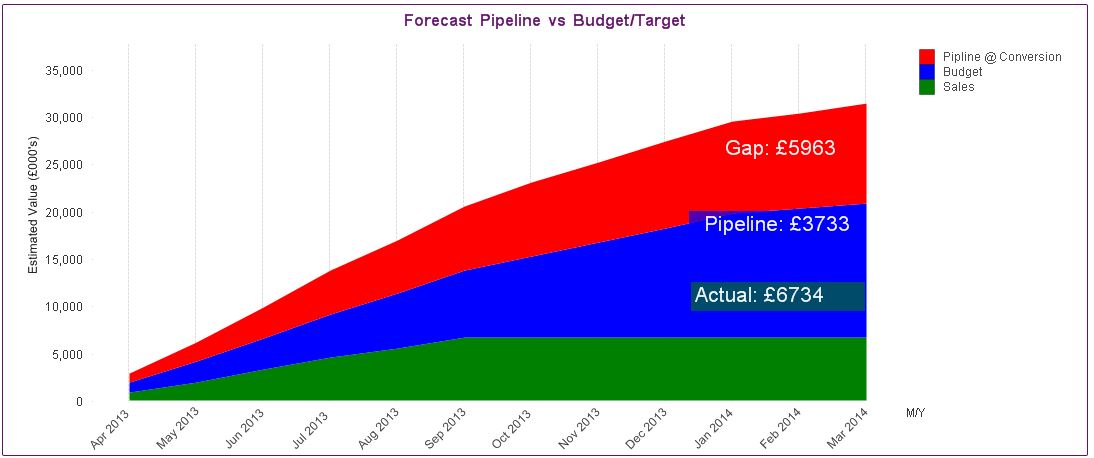
I'm afraid it's quite a hefty app but I've attached a simplified version which illustrates the point nicely. If you change the look of the line graph in this App then it all of a sudden becomes misleading. What it seems to be doing is stacking the areas on top of each other. I don't want it to do this. (See DESIRED RESULT in first post illustrate what I'm after.
- Mark as New
- Bookmark
- Subscribe
- Mute
- Subscribe to RSS Feed
- Permalink
- Report Inappropriate Content
That's correct. The values are stacked. What you need to do for the Gap and Pipeline expressions is to subtract the values of the other expression below from the expression value. Meaning Gap becomes Gap-Pipeline-Sales and Pipeline becomes Pipeline - Sales. If you use the stacked area option your expression values should be the differences, not the absolute values.
talk is cheap, supply exceeds demand
- Mark as New
- Bookmark
- Subscribe
- Mute
- Subscribe to RSS Feed
- Permalink
- Report Inappropriate Content
That's helpful thanks and I understand the logic - I can't figure out what I'm doing wrong here though - the graph seems to be doing all sorts of things - I've experimented with the order of the calcs and accumulations (they all need to be accumulated values of course) but I still cant quite get it - the new version of my test App is attached - any help appreciated. Could it be because when the data exceeds "Target" it causes an issue?
- Mark as New
- Bookmark
- Subscribe
- Mute
- Subscribe to RSS Feed
- Permalink
- Report Inappropriate Content
Hi Folks - the penny has dropped - the expressions need some if statements to deal with negative values (i.e. You sales beats budgets so gap is negative). Correct Test App is attached for future reference.
Thanks to everybody for their help couldn't have done it without you.
Cheers
Stu