Unlock a world of possibilities! Login now and discover the exclusive benefits awaiting you.
- Qlik Community
- :
- All Forums
- :
- QlikView App Dev
- :
- Re: Pipeline Metrics
- Subscribe to RSS Feed
- Mark Topic as New
- Mark Topic as Read
- Float this Topic for Current User
- Bookmark
- Subscribe
- Mute
- Printer Friendly Page
- Mark as New
- Bookmark
- Subscribe
- Mute
- Subscribe to RSS Feed
- Permalink
- Report Inappropriate Content
Pipeline Metrics
How do I graph pipeline metrics in a funnel format? I can graph as bar, however, when I chg to Funnel, it skews the values.
- Mark as New
- Bookmark
- Subscribe
- Mute
- Subscribe to RSS Feed
- Permalink
- Report Inappropriate Content
Well, first off, the funnel chart is not a very useful medium for displaying data. It has almost all the shortcoming of a pie chart, so you may want to consider avoiding it altogether.
That said, you can go to the Presentation tab and modify the Data Proportionality settings to see if that makes it better.
Regards,
Vlad
- Mark as New
- Bookmark
- Subscribe
- Mute
- Subscribe to RSS Feed
- Permalink
- Report Inappropriate Content
Hi,
in properties > presentation tab, there's an option called "Data proportionality", which lets you arrange data depending on height, weight or equal segments,
maybe that helps
regards
- Mark as New
- Bookmark
- Subscribe
- Mute
- Subscribe to RSS Feed
- Permalink
- Report Inappropriate Content
Can you provide a screen shot? I am not showing the option of “Data proportionality”. ☹
Tami
Tami Martinez | Reporting & Campaign Systems Specialist
Televerde | 4636 E. University Drive, Suite 150 | Phoenix | Arizona | 85034
Direct +1 480-517-6166 | Fax +1 480-967-1402
Follow Us: <http://twitter.com/televerde> <http://www.facebook.com/Televerde?sid=fda9f55b5870f45> <http://www.youtube.com/televerde> <http://www.linkedin.com/companies/televerde?goback=.cps_1237136210503_1>
Learn About Our Capabilities<http://www.televerde.com/webinars/>
- Mark as New
- Bookmark
- Subscribe
- Mute
- Subscribe to RSS Feed
- Permalink
- Report Inappropriate Content
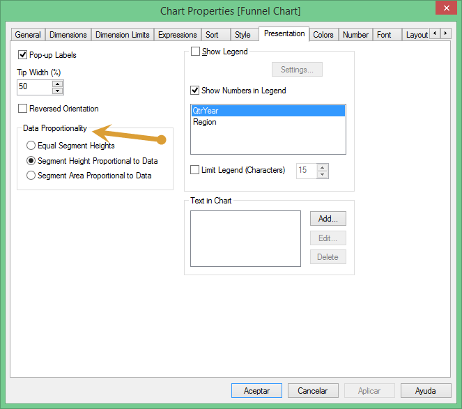 Sure,
Sure,
here it is:
remember properties > presentation tab
- Mark as New
- Bookmark
- Subscribe
- Mute
- Subscribe to RSS Feed
- Permalink
- Report Inappropriate Content
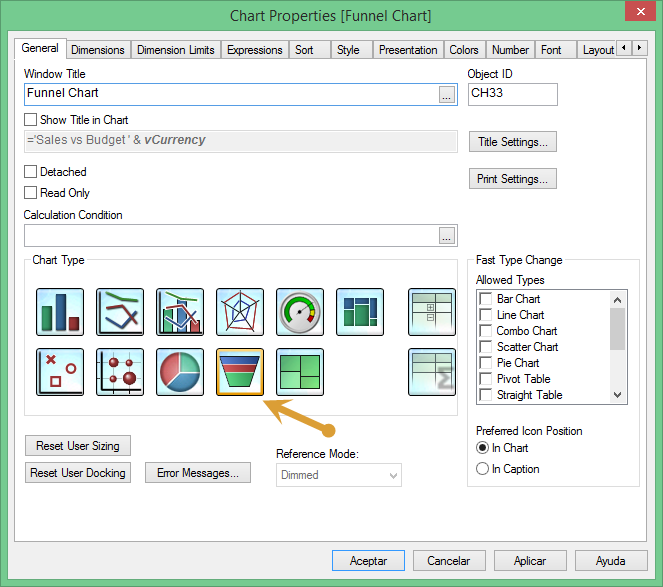
See I am in the Propertied of the Presentation tab and I do not see this option. See my screen shot below:
Tami
Tami Martinez | Reporting & Campaign Systems Specialist
Televerde | 4636 E. University Drive, Suite 150 | Phoenix | Arizona | 85034
Direct +1 480-517-6166 | Fax +1 480-967-1402
Follow Us: <http://twitter.com/televerde> <http://www.facebook.com/Televerde?sid=fda9f55b5870f45> <http://www.youtube.com/televerde> <http://www.linkedin.com/companies/televerde?goback=.cps_1237136210503_1>
Learn About Our Capabilities<http://www.televerde.com/webinars/>
- Mark as New
- Bookmark
- Subscribe
- Mute
- Subscribe to RSS Feed
- Permalink
- Report Inappropriate Content
Make sure you have selected the correct type of chart in general tab: