Unlock a world of possibilities! Login now and discover the exclusive benefits awaiting you.
- Qlik Community
- :
- All Forums
- :
- QlikView App Dev
- :
- Re: Dimensions on datapoints
- Subscribe to RSS Feed
- Mark Topic as New
- Mark Topic as Read
- Float this Topic for Current User
- Bookmark
- Subscribe
- Mute
- Printer Friendly Page
- Mark as New
- Bookmark
- Subscribe
- Mute
- Subscribe to RSS Feed
- Permalink
- Report Inappropriate Content
Dimensions on datapoints
I have several types of country scores. In a chart I am using one score-type as an expression and the other score-types as dimensions. This enables me to investigate correlations between the scores.
I am using a line chart in which all the data points are displayed as symbols. I can simply add the values of the score type which I use as an expression to the data points/symbols. But how can I add the country names (dimension values) to the data points/symbols?
Maurice
Accepted Solutions
- Mark as New
- Bookmark
- Subscribe
- Mute
- Subscribe to RSS Feed
- Permalink
- Report Inappropriate Content
Now that I see your chart I think is better to use a scatter chart for showing scores relations (see here Qlik Demos: See QlikView in Action | Demo.Qlik.Com for when to use which chart)
See attachment, second tab
- Mark as New
- Bookmark
- Subscribe
- Mute
- Subscribe to RSS Feed
- Permalink
- Report Inappropriate Content
Is it what you are looking for?
if not, kindly load your apps.
- Mark as New
- Bookmark
- Subscribe
- Mute
- Subscribe to RSS Feed
- Permalink
- Report Inappropriate Content
Hi,
You can make a calculated dimension by concatenating country names and first scores:
= CountryName & ' - ' & FirstScore
then sort this dimension by Maxstring(FirstScore&CountryName) ascending for example.
Hope this helps
- Mark as New
- Bookmark
- Subscribe
- Mute
- Subscribe to RSS Feed
- Permalink
- Report Inappropriate Content
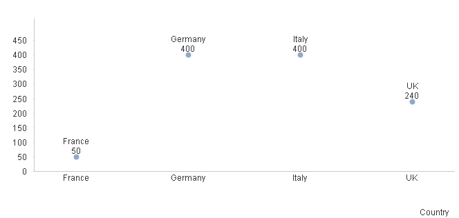
you can change your score expression to have a text and a num value
dual(Country & chr(10) & num(Sum(Score), ',#,##0'), Sum(Score))
flag "Value on Data Points" in "Expression" tab
set "Expression Default" as "Number Format Settings" in Number tab
- Mark as New
- Bookmark
- Subscribe
- Mute
- Subscribe to RSS Feed
- Permalink
- Report Inappropriate Content
All answers are helpful. You are showing the dimension 'country' on the X-axis. My X-axis shows another score type as a dimension with a value range. The country dots display the country's score on the Y-axis and on the X-axis.
I just needed to add the field 'country' as an expression and then activate the 'Values on Data Points' and hide the lines or symbols for this expression.
The problem I have now is that countries with the same dimension scores are not displayed. Probably because he totalizes the scores for each dimension (which is another score).
- Mark as New
- Bookmark
- Subscribe
- Mute
- Subscribe to RSS Feed
- Permalink
- Report Inappropriate Content
In the attached QVW the score_B values 7 and 9 do not show a country since more countries do have these values 7 and 9 on Score_B.
- Mark as New
- Bookmark
- Subscribe
- Mute
- Subscribe to RSS Feed
- Permalink
- Report Inappropriate Content
Now that I see your chart I think is better to use a scatter chart for showing scores relations (see here Qlik Demos: See QlikView in Action | Demo.Qlik.Com for when to use which chart)
See attachment, second tab
- Mark as New
- Bookmark
- Subscribe
- Mute
- Subscribe to RSS Feed
- Permalink
- Report Inappropriate Content
Thanks a lot Massimo, That is was the chart I was looking for.
Maurice
- Mark as New
- Bookmark
- Subscribe
- Mute
- Subscribe to RSS Feed
- Permalink
- Report Inappropriate Content
Hi Massimo,
Could you please resend me the QVW you send me with this solution?
Thanks,
Maurice
- Mark as New
- Bookmark
- Subscribe
- Mute
- Subscribe to RSS Feed
- Permalink
- Report Inappropriate Content
you can download it (attachment) 2 post above, Jan 27, 2014 3:07 PM