Unlock a world of possibilities! Login now and discover the exclusive benefits awaiting you.
- Qlik Community
- :
- All Forums
- :
- QlikView App Dev
- :
- Re: How to make only selected line chart diff colo...
- Subscribe to RSS Feed
- Mark Topic as New
- Mark Topic as Read
- Float this Topic for Current User
- Bookmark
- Subscribe
- Mute
- Printer Friendly Page
- Mark as New
- Bookmark
- Subscribe
- Mute
- Subscribe to RSS Feed
- Permalink
- Report Inappropriate Content
How to make only selected line chart diff color from other ?
Hi All
http://community.qlik.com/blogs/qlikviewdesignblog
I just happen to look at the latest blog design post , and i try to do it for my application , it does not work.
in my app i only have one field that that is COMPETITOR . But in the blog post , it have 2 field :-
Store
Store Name
So i am not able to understand how can i get 2 field ?
Paul
Accepted Solutions
- Mark as New
- Bookmark
- Subscribe
- Mute
- Subscribe to RSS Feed
- Permalink
- Report Inappropriate Content
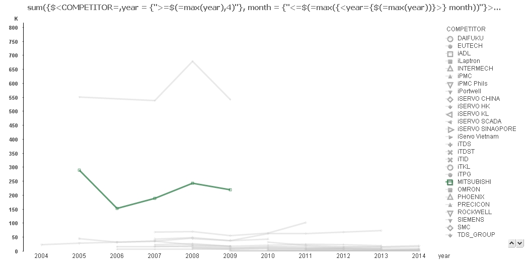
I redo the chart using
- your dimensions
year, COMPETITOR
- your expression (+ COMPETITOR in bold)
sum({$<COMPETITOR=, year = {">=$(=max(year),4)"}, month = {"<=$(=max({<year={$(=max(year))}>} month))"}>} REVENUE_C)/1000
- background color
if(isnull(only([COMPETITOR])) ,ARGB(100,200,200,200),ARGB(190,43, 123, 70))
and i get
- Mark as New
- Bookmark
- Subscribe
- Mute
- Subscribe to RSS Feed
- Permalink
- Report Inappropriate Content
Hi Paul,
The way you had the highlighted line showing would only work if there was only one selected COMPETITOR. You can approach this using Set Analysis and have any possible dimension values highlighted with all the others transparent.
In your example the Set Analysis around year was causing confusion, so I took it out, similarly with the Dimension Limits.
The expression was then:
sum({$<COMPETITOR=>} REVENUE_C)/1000
And the Background Colour expression was:
if(sum(REVENUE_C) > 0 ,RGB(43, 123, 70),ARGB(30,0,0,0))
This then gives a chart like this when two values are selected:
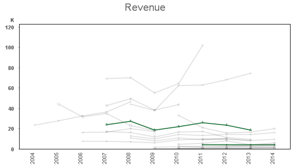
What is going on here is the COMPETITOR= in the expression is causing the selection on the Competitors to be ignored - hence all lines show all the time. In the colour expression we are doing the same expression in the if, but without the set analysis sum(REVENUE_C) > 0 , so only when the calculation without set analysis gives a result do we colour the line green, otherwise we go for a highly transparent black line - giving the result you see.
Because you had two outliers in your data it made the chart work less well (so I removed them), also the fact that not all competitors exist across all ten years it doesn't work quite so good.
Hopefully it illustrates how to achieve what Arturo Muñoz was showing in his blog post though.
Cheers,
Steve
- Mark as New
- Bookmark
- Subscribe
- Mute
- Subscribe to RSS Feed
- Permalink
- Report Inappropriate Content
I redo the chart using
- your dimensions
year, COMPETITOR
- your expression (+ COMPETITOR in bold)
sum({$<COMPETITOR=, year = {">=$(=max(year),4)"}, month = {"<=$(=max({<year={$(=max(year))}>} month))"}>} REVENUE_C)/1000
- background color
if(isnull(only([COMPETITOR])) ,ARGB(100,200,200,200),ARGB(190,43, 123, 70))
and i get
- Mark as New
- Bookmark
- Subscribe
- Mute
- Subscribe to RSS Feed
- Permalink
- Report Inappropriate Content
Hi All
Thank you very much , now my chart look great.
Paul
- Mark as New
- Bookmark
- Subscribe
- Mute
- Subscribe to RSS Feed
- Permalink
- Report Inappropriate Content
Hi Massimo
I just try to create another chart which is having the same purpose , below is the link :-
How to make selected Line chart turn Green and the rest not selected turn Gray ?
I just cannot get it work. Not sure why , hope you can take a look .
Paul