Unlock a world of possibilities! Login now and discover the exclusive benefits awaiting you.
Announcements
Qlik Connect 2025: 3 days of full immersion in data, analytics, and AI. May 13-15 | Orlando, FL:
Learn More
- Qlik Community
- :
- All Forums
- :
- QlikView App Dev
- :
- Line Graph Designing.
Options
- Subscribe to RSS Feed
- Mark Topic as New
- Mark Topic as Read
- Float this Topic for Current User
- Bookmark
- Subscribe
- Mute
- Printer Friendly Page
Turn on suggestions
Auto-suggest helps you quickly narrow down your search results by suggesting possible matches as you type.
Showing results for
Not applicable
2014-04-17
12:08 AM
- Mark as New
- Bookmark
- Subscribe
- Mute
- Subscribe to RSS Feed
- Permalink
- Report Inappropriate Content
Line Graph Designing.
Hi folks,
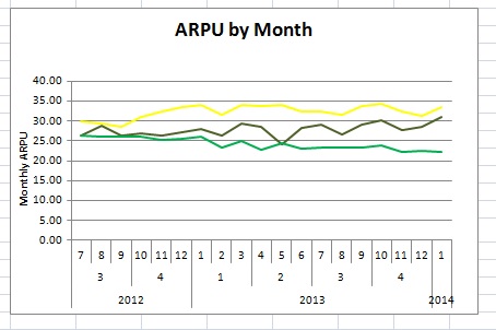
I am trying to translate this excel graph into a line chart in QV. Any idea how to do so? Any tutorials/references that I can read to get a clear picture on how I can go about doing it? View image below:
Thanks in advance.
Best Regards,
R
342 Views
2 Replies
MVP
2014-04-17
12:17 AM
- Mark as New
- Bookmark
- Subscribe
- Mute
- Subscribe to RSS Feed
- Permalink
- Report Inappropriate Content
Refer the reference manual or in the samples where a nice example in 11.0 version Data Visualization use this example for the line graph there are so many graphs.
232 Views
Creator II
2014-04-17
02:40 AM
- Mark as New
- Bookmark
- Subscribe
- Mute
- Subscribe to RSS Feed
- Permalink
- Report Inappropriate Content
Can't you just convert it into a table and load it into Qlikview?
232 Views