Unlock a world of possibilities! Login now and discover the exclusive benefits awaiting you.
- Qlik Community
- :
- All Forums
- :
- QlikView App Dev
- :
- Re: Re: Colouring part of a pivot table expression
- Subscribe to RSS Feed
- Mark Topic as New
- Mark Topic as Read
- Float this Topic for Current User
- Bookmark
- Subscribe
- Mute
- Printer Friendly Page
The message you are trying to access is permanently deleted.
- Mark as New
- Bookmark
- Subscribe
- Mute
- Subscribe to RSS Feed
- Permalink
- Report Inappropriate Content
Colouring part of a pivot table expression
I have the following expression in a pivot table chart
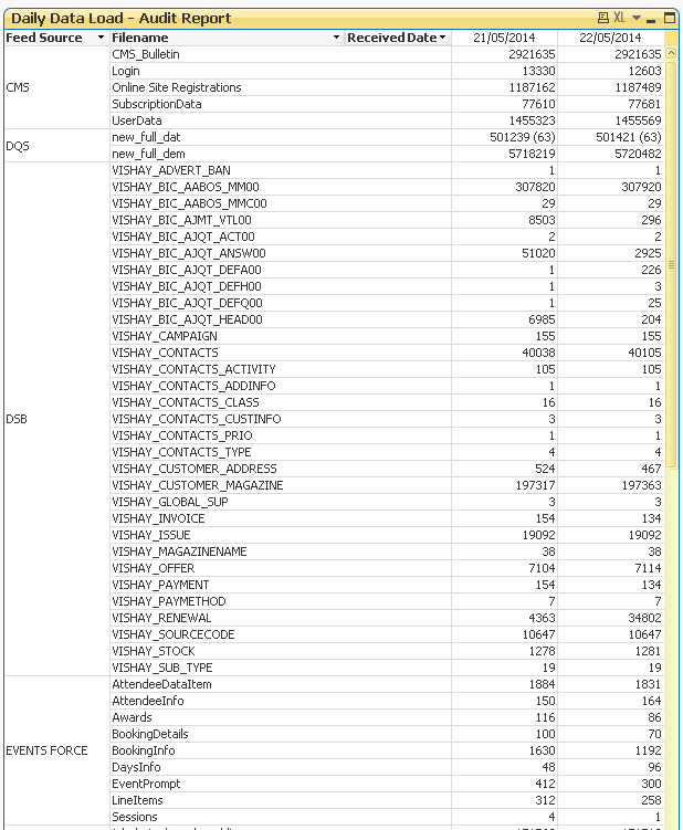
If(Sum(RowsWithErrors)=0,Sum(RowsRead),Sum(RowsRead) & ' (' & Sum(RowsWithErrors) & ')')
I would like if possible to colour the part in bold so it shows as red in the pivot table
Any ideas?
Message was edited by: Paul Nockolds - I've added the qvw in case anyone has any great ideas (see sheet 2)
- Mark as New
- Bookmark
- Subscribe
- Mute
- Subscribe to RSS Feed
- Permalink
- Report Inappropriate Content
Why not to use 2 columns?
1'st: Sum(RowsRead)
2'nd: Sum(RowsWithErrors)
???
- Mark as New
- Bookmark
- Subscribe
- Mute
- Subscribe to RSS Feed
- Permalink
- Report Inappropriate Content
Yes i could do and in fact have the RowsWithErrors expression disabled as a separate column right now but each day will add a new column as there's a new file every day, so it will grow and grow over time so i thought having only one column might be easier
- Mark as New
- Bookmark
- Subscribe
- Mute
- Subscribe to RSS Feed
- Permalink
- Report Inappropriate Content
But you will be able to do partial sums etc....
Or maybe better to use some visual chart. For exmaple in Bar Chart you hav "HasErrorBars" option.
regards
Darek
- Mark as New
- Bookmark
- Subscribe
- Mute
- Subscribe to RSS Feed
- Permalink
- Report Inappropriate Content
Currently it looks like this and each day will add a new column. I just thought being able to highlight the bracketed number (if any) would help to highlight files that have error rows in them...
- Mark as New
- Bookmark
- Subscribe
- Mute
- Subscribe to RSS Feed
- Permalink
- Report Inappropriate Content
I don't think you can change just part of a cell, it seems to be an "all or nothing" deal.