Unlock a world of possibilities! Login now and discover the exclusive benefits awaiting you.
- Qlik Community
- :
- All Forums
- :
- QlikView App Dev
- :
- Re: Re: pie charts setting default color
- Subscribe to RSS Feed
- Mark Topic as New
- Mark Topic as Read
- Float this Topic for Current User
- Bookmark
- Subscribe
- Mute
- Printer Friendly Page
- Mark as New
- Bookmark
- Subscribe
- Mute
- Subscribe to RSS Feed
- Permalink
- Report Inappropriate Content
pie charts setting default color
hi
i have created a pie chart.. normally when we select one data value the pie chart becomes one individual color cz it represent only one value.. is there any possibility that i can fix the pie chart (normally when we select detach the pie chart values wont change/ move) but when i select a particular value except that particular segment, the other segments has to change in to a default color(ash color)
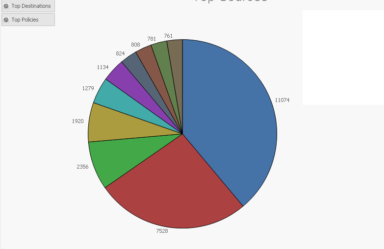
this image shows my present display 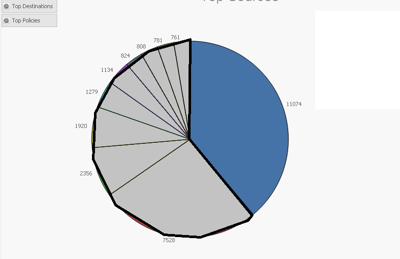 if i select the blue area with the value 11074 i want my pie chart to be displayed as the below image..
if some one can help me in this it would be really appreciated..
thank you in advance 
- Mark as New
- Bookmark
- Subscribe
- Mute
- Subscribe to RSS Feed
- Permalink
- Report Inappropriate Content
nothing happened 😕 tried both ways
- Mark as New
- Bookmark
- Subscribe
- Mute
- Subscribe to RSS Feed
- Permalink
- Report Inappropriate Content
Can you share your app?
Sergey
- Mark as New
- Bookmark
- Subscribe
- Mute
- Subscribe to RSS Feed
- Permalink
- Report Inappropriate Content
sorry Sergey i can't share it cz of office reasons 😕 the colors change in to all pinkish colors doesn't look professional at all 😕
- Mark as New
- Bookmark
- Subscribe
- Mute
- Subscribe to RSS Feed
- Permalink
- Report Inappropriate Content
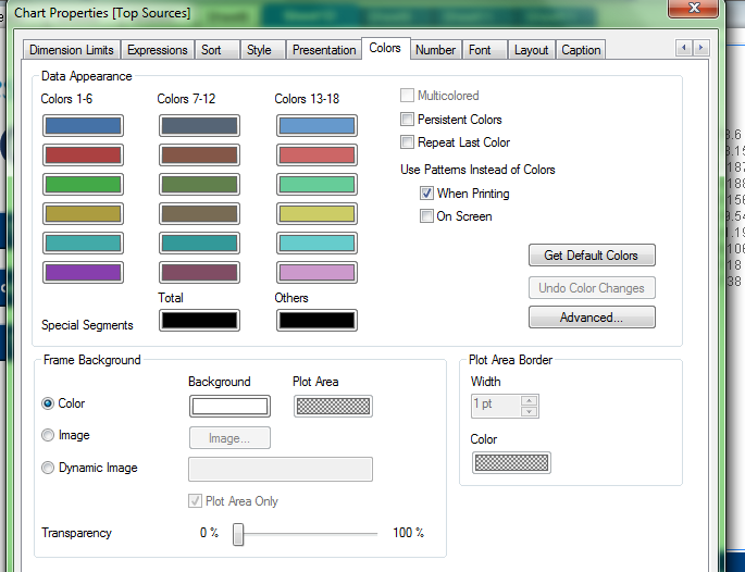
Please share screenshot of your color tab
Sergey
- Mark as New
- Bookmark
- Subscribe
- Mute
- Subscribe to RSS Feed
- Permalink
- Report Inappropriate Content
Looks like you have more than 18 values. Try adjusting your expression as follows:
=if(Source=Source, color( mod(FieldIndex('Source',Source)-1,18)+1 ), LightGray())
-Rob
- Mark as New
- Bookmark
- Subscribe
- Mute
- Subscribe to RSS Feed
- Permalink
- Report Inappropriate Content
- Mark as New
- Bookmark
- Subscribe
- Mute
- Subscribe to RSS Feed
- Permalink
- Report Inappropriate Content
hi Rob
after adding your expression my chart looks like the below image 😕 i have colors repeating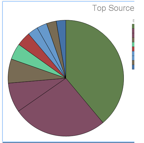

- Mark as New
- Bookmark
- Subscribe
- Mute
- Subscribe to RSS Feed
- Permalink
- Report Inappropriate Content
There are only 18 colors in the palette. The only way I can think of is to avoid repeating colors is to assign a unique color to every dimension value in the load and then a reference to that color in the background color expression.
Alternatively, you could get a better distribution across 18 colors with an expression that uses some combination of index() and concat() to sequentially assign from the 18 color palette.
However, I would question the overall usefulness of having a Pie with some many slices. Have you considered using Dimension limits to limit to the top n values and throw the rest into the "Others" bucket?
-Rob
- Mark as New
- Bookmark
- Subscribe
- Mute
- Subscribe to RSS Feed
- Permalink
- Report Inappropriate Content
Rob i have only 10 segments as shown in the above image... i want to show these 10 segments without repeating the colors and i really would prefer if i could change this color code and make it more professional is it possible??
- Mark as New
- Bookmark
- Subscribe
- Mute
- Subscribe to RSS Feed
- Permalink
- Report Inappropriate Content
I feel like I'm missing something. You shouldn't have repeating colors if your underlying data has less than 18 values, but maybe I'm misunderstanding something. It would be easier if you could share a scrambled version of your app. Anyways, here's an expression (getting complex though) that will distribute any values over the 18 colors.
=if(Customer=Customer
,color(mod(
Match(
Customer
,$(=chr(39) & concat(Customer,chr(39) & ',' & chr(39)) & chr(39))
)
-1,18)+1)
, LightGray())