Unlock a world of possibilities! Login now and discover the exclusive benefits awaiting you.
- Qlik Community
- :
- All Forums
- :
- QlikView App Dev
- :
- Re: Re: Color Changing based on Distribution
- Subscribe to RSS Feed
- Mark Topic as New
- Mark Topic as Read
- Float this Topic for Current User
- Bookmark
- Subscribe
- Mute
- Printer Friendly Page
- Mark as New
- Bookmark
- Subscribe
- Mute
- Subscribe to RSS Feed
- Permalink
- Report Inappropriate Content
Color Changing based on Distribution
Hello,
I am trying to make a chart such that all of the columns are the same color except for when the report is distributed to various users their particular bar will change color and all other users bars will stay the same. So when a user logs in to view their report they will see them self as a distinct color. How can this be achieved?
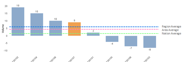
Report is distributed based on users. When user 130107 logs in they will see them self as a distinct color without anything else changing.
Thank You
- Mark as New
- Bookmark
- Subscribe
- Mute
- Subscribe to RSS Feed
- Permalink
- Report Inappropriate Content
you can try the QVUSER() function. Try it in a text box function first to see if the value it returns is the same as the User values in your chart. You may need some manipulation of the model or the function to get the same values.
If its the same you can use the 'background color' property of the expression to set the condition. On the expression tab, expand your expression by hitting the + sign and enter a condition like this:
if ( User = QVUSER() , lightred(), blue())
- Mark as New
- Bookmark
- Subscribe
- Mute
- Subscribe to RSS Feed
- Permalink
- Report Inappropriate Content
- Mark as New
- Bookmark
- Subscribe
- Mute
- Subscribe to RSS Feed
- Permalink
- Report Inappropriate Content
Thank you both for your input. I would like to make this less user based.
In this scenario there is a chance that more than 1 user could be assigned the same report. So, in a sense, 2 different users could be looking at the exact same report and both would have the same column assigned to them, which would be a different color.
The above example that I provided was a bit crude and I apologize. Here is a better example:
The report is distributed based on geography to different sales reps. The x-axis now represents various geographies. Many users can be assigned to each particular geography - so multiple users will be assigned to geo '130107'. So when the users for geo '130107' log in they will see their geo as a distinct color amongst peer geos. 
Thank You.
- Mark as New
- Bookmark
- Subscribe
- Mute
- Subscribe to RSS Feed
- Permalink
- Report Inappropriate Content
You'll need a user field in the data model that associates to the geos. Then what I think may work is :
Substringcount(Concat( distinct [user],';'), qvuser()) > 0
This Will check if the osuser value is in a delimited list of user values associated to each geo in the chart. If it is associated and finds a match then you can colornaccordingly. I'm typing from my phone so can't upload a sample. Does that help?
- Mark as New
- Bookmark
- Subscribe
- Mute
- Subscribe to RSS Feed
- Permalink
- Report Inappropriate Content
First off, let me say that I think this is a very cool idea! Expanding on Jonathan's idea a bit, here's one approach.
// Some sample data
data:
LOAD * INLINE [
Group, Value
A, 100
B, 200
C, 150
D, 300
]
;
// Load every potential userid and their Group association.
// "red()" is whatever you want the callout color to be
Colors:
LOAD *, red() as GroupColor Inline [
Group, User
A, domain\Ralf
B, domain\Rob
C, domain\Joe
]
;
Assuming a chart with dimension "Group", the Expression Background Color expression in the chart is:
=only({<User={'$(=OsUser())'}>}GroupColor)
The current OsUser()'s Group will be red(), others will use the default because the color expression will return null() for those groups.
-Rob
- Mark as New
- Bookmark
- Subscribe
- Mute
- Subscribe to RSS Feed
- Permalink
- Report Inappropriate Content
Ya wow this is very helpful. Great ideas from both. Thank you!
- Mark as New
- Bookmark
- Subscribe
- Mute
- Subscribe to RSS Feed
- Permalink
- Report Inappropriate Content
A more simple solution would be opening on a screen where the user selects his region from a list box on a 'data island table'.
Script:
GeoSelector:
LOAD * Inline [
Geography
North
South
East
West
];
Add the GeoSelector field to your first sheet (with the 'only select 1' value option).
Then the background color expression would be:
=if(geo=only(GeoSelector),red(),green())
- Mark as New
- Bookmark
- Subscribe
- Mute
- Subscribe to RSS Feed
- Permalink
- Report Inappropriate Content
So I wound up using this in my expression:
=only({$<[GeoLevel]={$(=if(
SubStringCount([GeoLevel],'BOSTON, MA') or
SubStringCount([GeoLevel],'ALBANY, NY') or
SubStringCount([GeoLevel],'BOSTON S, MA') or
SubStringCount([GeoLevel],'HARTFORD, CT') or
SubStringCount([GeoLevel],'BOSTON N, MA') or
SubStringCount([GeoLevel],'MANCHESTER, NH') or
SubStringCount([GeoLevel],'BUFFALO, NY') or
SubStringCount([GeoLevel],'BRONX, NY'),
chr(39)&'BOSTON, MA'&chr(39)&','&
chr(39)&'ALBANY, NY'&chr(39)&','&
chr(39)&'BOSTON S, MA'&chr(39)&','&
chr(39)&'HARTFORD, CT'&chr(39)&','&
chr(39)&'BOSTON N, MA'&chr(39)&','&
chr(39)&'MANCHESTER, NH'&chr(39)&','&
chr(39)&'BUFFALO, NY'&chr(39)&','&
chr(39)&'BRONX, NY'&chr(39)
))}>}[Volume])
And I had several more geographies to group together. So, I set these GeoLevel clusters into variables and wound up using this as my expression:
=only({$<[GeoLevel]={$(=
if(
vTerrNewEnglandif,
vTerrNewEnglandthen
,if
(vTerrNYNJif,
vTerrNYNJthen,
if(
vTerrPennif,
vTerrPennthen,
if(
vTerrCapitolif,
vTerrCapitolthen,
if(
vTerrGLif,
vTerrGLthen,
'fail')
)))))}>}[Volume])
i have been told that the structuring of the GeoLevel 'clusters' will change. So I would like add a column that would map back to a geography. So i will essentially be using a parent column to map back to show the clusters. For the sake of simplicity here is what my table currently looks like:
GeoLevel Value
BOSTON, MA xx
ALBANY, NY xx
BOSTON S, MA xx
HARTFORD, CT xx
And I want to transform this into:
GeoLevel Parent Value
BOSTON, MA NorthEast xx
ALBANY, NY NorthEast xx
BOSTON S, MA NorthEast xx
HARTFORD, CT NorthEast xx
And so what I want to say in my expression is that if a GeoLevel is selected then show all of the GeoLevels in that Parent. How would I go about doing this??
Thank You!!