Unlock a world of possibilities! Login now and discover the exclusive benefits awaiting you.
- Qlik Community
- :
- All Forums
- :
- QlikView App Dev
- :
- Re: Forecast in Qlikview
- Subscribe to RSS Feed
- Mark Topic as New
- Mark Topic as Read
- Float this Topic for Current User
- Bookmark
- Subscribe
- Mute
- Printer Friendly Page
- Mark as New
- Bookmark
- Subscribe
- Mute
- Subscribe to RSS Feed
- Permalink
- Report Inappropriate Content
Forecast in Qlikview
Hi All,
I have a table with 86 entries, with two columns - row and quantity. I have another table with forecasted entries, this time having 96 entries in total, but same number of columns.
Is there a way to display both of them against each other in a single chart?
Here are more details -
Table1:
Row (1-86)
Quantity
Table2:
Row1 (1-96)
Quantity1
Now, I created a line chart with:
Dimensions : Row1
Expressions: Quantity, Quantity1.
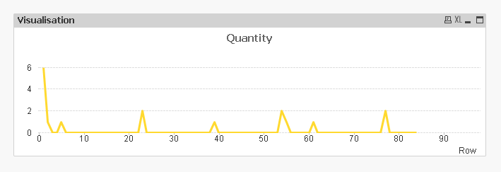
Below is the graph I get - with just a yellow line. Whereas I need a graph with 2 lines.
Any help would be greatly appreciated. Thanks!
Durga.
- Mark as New
- Bookmark
- Subscribe
- Mute
- Subscribe to RSS Feed
- Permalink
- Report Inappropriate Content
Make sure the fields with the row numbers have the same name.
talk is cheap, supply exceeds demand
- Mark as New
- Bookmark
- Subscribe
- Mute
- Subscribe to RSS Feed
- Permalink
- Report Inappropriate Content
Table1:
LOAD
Row (1-86) as Row
Quantity
from table1
Concatenate (Table 1)
Row1 (1-96) as Row
Quantity1 as Forecast
from table 2
In your chart, row as dimension and Sum(Quantity) and Sum(Forecast) as expressions
- Mark as New
- Bookmark
- Subscribe
- Mute
- Subscribe to RSS Feed
- Permalink
- Report Inappropriate Content
Rename both fields Row (1-86) and Row1 (1-96) to an equal name and concatenate the 2 tables.
Also rename your quantity fields to (for instance) quantity and forecast for your legend names.
Table1:
Row (1-86) as Row
Quantity
Table2:
concatenate (Table1)
Row1 (1-96) as Row
Quantity1 as Forecast
- Mark as New
- Bookmark
- Subscribe
- Mute
- Subscribe to RSS Feed
- Permalink
- Report Inappropriate Content
Hi ,
This would help you