Unlock a world of possibilities! Login now and discover the exclusive benefits awaiting you.
- Qlik Community
- :
- All Forums
- :
- QlikView
- :
- Re: Trendline slope
- Subscribe to RSS Feed
- Mark Topic as New
- Mark Topic as Read
- Float this Topic for Current User
- Bookmark
- Subscribe
- Mute
- Printer Friendly Page
- Mark as New
- Bookmark
- Subscribe
- Mute
- Subscribe to RSS Feed
- Permalink
- Report Inappropriate Content
Trendline slope
Hello
Is there any possibility of having in the table slope of a trendline?
I've got amount of sales in time and i'd like to have % value of the trendline in a table so i could tell if sales are increasing or decreasing.
- Tags:
- trendline
Accepted Solutions
- Mark as New
- Bookmark
- Subscribe
- Mute
- Subscribe to RSS Feed
- Permalink
- Report Inappropriate Content
Hello Zelman,
This is possible and it's very simple. You can use the function called "Linest_m". Linest_m returns the slope of a linear regression defined by the equation y = mx + b.
So for example, you can have an expression in your table like this:
LINEST_M(aggr(nodistinct sum(Sales), Month, Product), Month)
If Linest_M > 0 then you have a positive trend, and if it's < 0 you have a negative trend .If it's 0, then the slope is undefined meaning that all data points (x, y) are equal.
You need to modify the aggr() function depending on what dimensions you want to aggregate your values.
I'm attaching an example.
JV.
- Mark as New
- Bookmark
- Subscribe
- Mute
- Subscribe to RSS Feed
- Permalink
- Report Inappropriate Content
Hi,
it is better if you could tell the specific requirement with an example..
and there are some trendline option available in your chart property>expression>Trendline (lower left corner).
HTH
sushil
- Mark as New
- Bookmark
- Subscribe
- Mute
- Subscribe to RSS Feed
- Permalink
- Report Inappropriate Content
Ok, some kind of example for better idea of what i want.
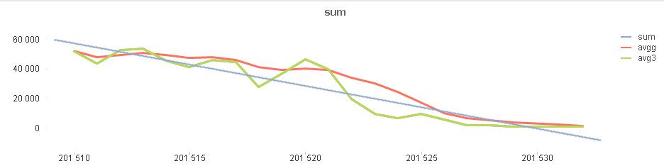
I've got this chart and i want blue line of trend to be in table.
Maybe % of slope, maybe there's some method to get value of starting and ending point so i could see if it's going up or down.
- Mark as New
- Bookmark
- Subscribe
- Mute
- Subscribe to RSS Feed
- Permalink
- Report Inappropriate Content
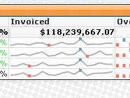
Hi Zelman15,
Do u want something like this?
Regards,
Prasad
- Mark as New
- Bookmark
- Subscribe
- Mute
- Subscribe to RSS Feed
- Permalink
- Report Inappropriate Content
I have already tried doing something like this and it's not what i'm looking for.
I have to tell if trending line is ascending or descending.
If there was possibility of putting trending line into this chart, it would be good enought for me, but i haven't found this option anywhere.
- Mark as New
- Bookmark
- Subscribe
- Mute
- Subscribe to RSS Feed
- Permalink
- Report Inappropriate Content
Hi,
I think can't be done what You want.
However, You can use ColorMix1() in background color of expression
like this
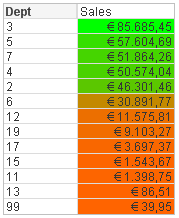
You can use wizard of ColorMix1()
or in background color You can use expression like If(Expr > Average,Green(),Red())
Regards,
Antonio
- Mark as New
- Bookmark
- Subscribe
- Mute
- Subscribe to RSS Feed
- Permalink
- Report Inappropriate Content
Hello Zelman,
This is possible and it's very simple. You can use the function called "Linest_m". Linest_m returns the slope of a linear regression defined by the equation y = mx + b.
So for example, you can have an expression in your table like this:
LINEST_M(aggr(nodistinct sum(Sales), Month, Product), Month)
If Linest_M > 0 then you have a positive trend, and if it's < 0 you have a negative trend .If it's 0, then the slope is undefined meaning that all data points (x, y) are equal.
You need to modify the aggr() function depending on what dimensions you want to aggregate your values.
I'm attaching an example.
JV.