Unlock a world of possibilities! Login now and discover the exclusive benefits awaiting you.
- Qlik Community
- :
- Forums
- :
- Analytics & AI
- :
- Products & Topics
- :
- App Development
- :
- Custom color by expression for two different expre...
- Subscribe to RSS Feed
- Mark Topic as New
- Mark Topic as Read
- Float this Topic for Current User
- Bookmark
- Subscribe
- Mute
- Printer Friendly Page
- Mark as New
- Bookmark
- Subscribe
- Mute
- Subscribe to RSS Feed
- Permalink
- Report Inappropriate Content
Custom color by expression for two different expressions
I have a stacked bar-chart, with one dimension and two expressions.
Both expressions have a different meaning, but should be stacked to indicate a total.
By choosing color "Auto" or "Custom - Multicolored" I get the following visualization:
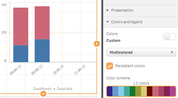
Almost perfect... Just not these default colors blue and purple-red-ish.
In the rest of my dashboard I use two custom colors for the meaning of these expressions, which I want to apply to this bar-chart.
Choosing color "Custom - By expression" allows me to create an expression to color. But I cannot seem to make a color-expression that results in a different color for the first and second expression. The single color-expressions seems to be applied on both expressions equally and I don't know if (and how) I can actually make an "IF"-statement to address them separately...
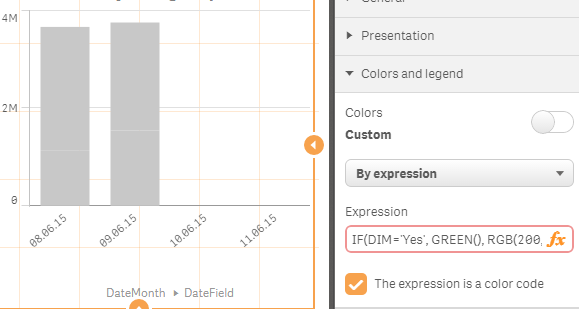
One of the attempts include an IF statement that checks for a dimension-value particular for one of the expressions.
Another attempt includes checking COLUMN(1), also didn't get that to work.
How can I use the custom color expression to set different colors for expressions?
- « Previous Replies
-
- 1
- 2
- Next Replies »
- Mark as New
- Bookmark
- Subscribe
- Mute
- Subscribe to RSS Feed
- Permalink
- Report Inappropriate Content
One way is to add a dummy dimension. For example:
Dummy:
LOAD * INLINE [
Dummy
A
B
];
You can then use that Dummy as second dimension in your chart together with only one expression like pick(match(Dummy, 'A','B'), sum(Foo), sum(Bar))
And you can then use a pick match for the color expression too: pick(match(Dummy, 'A','B'), Green(), RGB(200,50,150))
ps. wear shades if you use that second rgb color 
talk is cheap, supply exceeds demand
- Mark as New
- Bookmark
- Subscribe
- Mute
- Subscribe to RSS Feed
- Permalink
- Report Inappropriate Content
Smart! And useful as a workaround in some cases for sure.
Yet selecting that bar-chart will result in a field-selection on "Dummy", right? As well as the pop-up when doing a mouse-over.
- Mark as New
- Bookmark
- Subscribe
- Mute
- Subscribe to RSS Feed
- Permalink
- Report Inappropriate Content
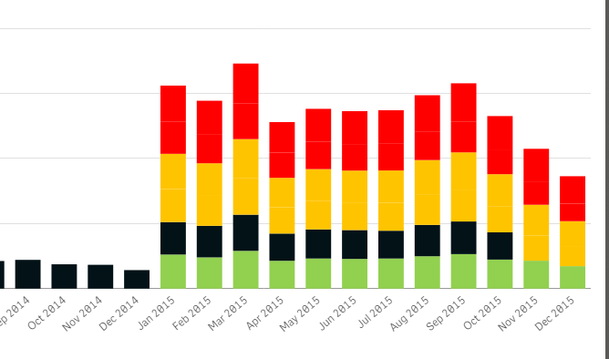
You're right about the pop-up. So you might want to use another field name than Dummy. Something that better describes the measures represented by the values of the dummy dimension. Selecting a bar segment won't select the value in the Dummy dimension. See attached example.
talk is cheap, supply exceeds demand
- Mark as New
- Bookmark
- Subscribe
- Mute
- Subscribe to RSS Feed
- Permalink
- Report Inappropriate Content
Hi!
I have a similar issue, but my graph is not stacked...
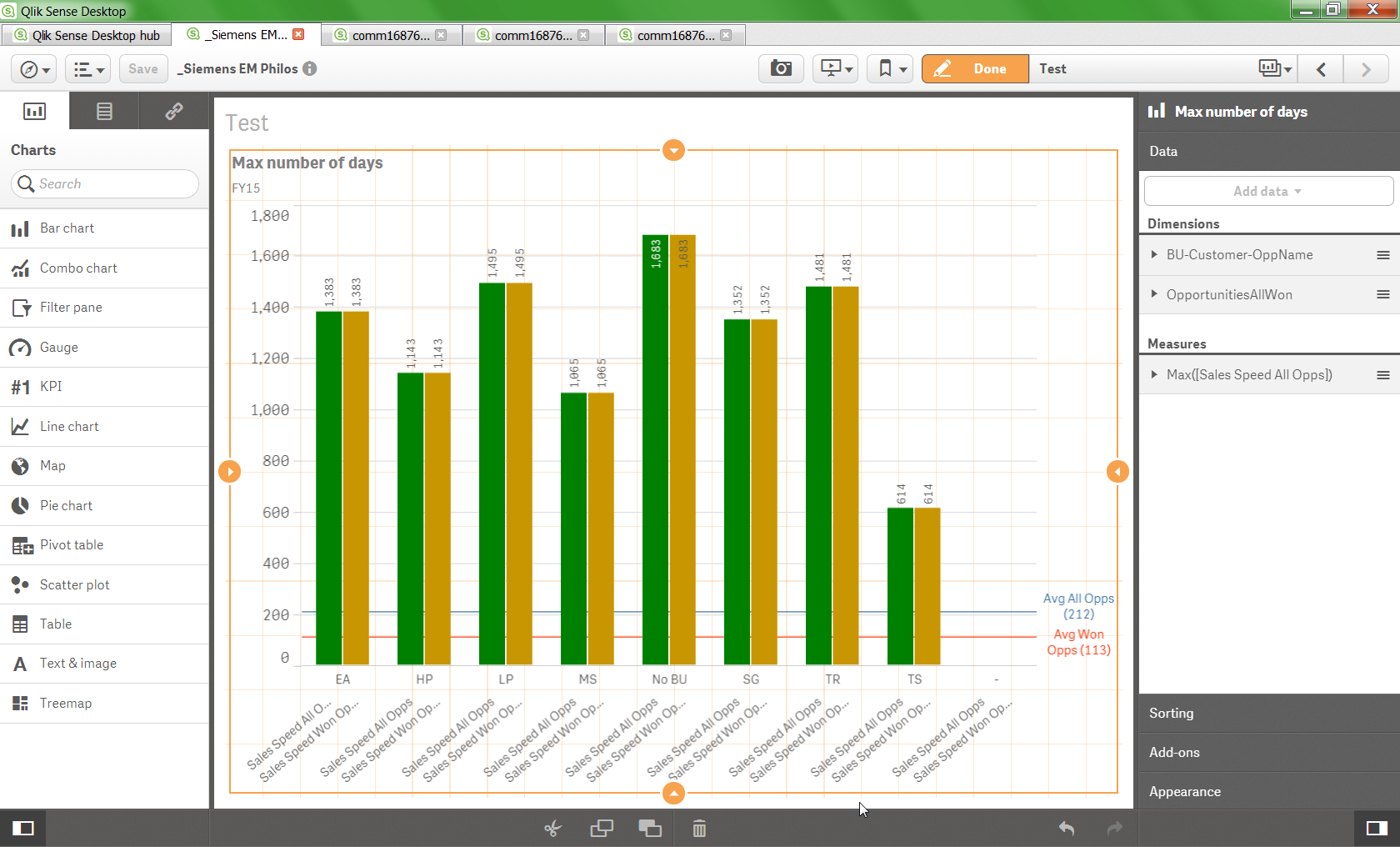
I used the Dummy in the Load Script provided by gwassenaar and it works ok (see the custom colours in my graph).
Problem is that Sense does not allow me to add an additional measure. The yellowish column should have other values (those from the measure I cannot add), not the same as the green one.
I am using a Dimension I created in the Master items (shown here are EA HP LP .... etc) in order to drill down (which btw uses the custom colours as well  ) and the Dummy as Dimension as well - maybe due to the drill down dimension I cannot add more than one measure?
DummyAllWon:
LOAD * INLINE [
OpportunitiesAllWon
Sales Speed All Opps
Sales Speed Won Opps
];
pick(match([OpportunitiesAllWon],'Sales Speed All Opps','Sales Speed Won Opps'),
green(),
rgb(200,150,0)
)
Thanks...!!
- Mark as New
- Bookmark
- Subscribe
- Mute
- Subscribe to RSS Feed
- Permalink
- Report Inappropriate Content
I switched for a non drill down Dimension and it does not allow me to add an additional measure 
- Mark as New
- Bookmark
- Subscribe
- Mute
- Subscribe to RSS Feed
- Permalink
- Report Inappropriate Content
Hi Gysbert,
Suppose you have two two measures and one dimension in it than how can we achieve it?.
- Mark as New
- Bookmark
- Subscribe
- Mute
- Subscribe to RSS Feed
- Permalink
- Report Inappropriate Content
Suppose you have two two measures and one dimension in it than how can we achieve it?.
Can you explain what you mean with "two two measures"? The case of two measures and one dimension has been demonstrated above.
talk is cheap, supply exceeds demand
- Mark as New
- Bookmark
- Subscribe
- Mute
- Subscribe to RSS Feed
- Permalink
- Report Inappropriate Content
- Mark as New
- Bookmark
- Subscribe
- Mute
- Subscribe to RSS Feed
- Permalink
- Report Inappropriate Content
Hi Allard,
I have answered the same question in this link : Re: How to use custom colours in a stacked bar chart with an attached QVF.
Hope this helps!
Thanks,
Sangram Reddy
- « Previous Replies
-
- 1
- 2
- Next Replies »