Unlock a world of possibilities! Login now and discover the exclusive benefits awaiting you.
- Qlik Community
- :
- All Forums
- :
- QlikView App Dev
- :
- Re: Time Actions for different chart displays
- Subscribe to RSS Feed
- Mark Topic as New
- Mark Topic as Read
- Float this Topic for Current User
- Bookmark
- Subscribe
- Mute
- Printer Friendly Page
- Mark as New
- Bookmark
- Subscribe
- Mute
- Subscribe to RSS Feed
- Permalink
- Report Inappropriate Content
Time Actions for different chart displays
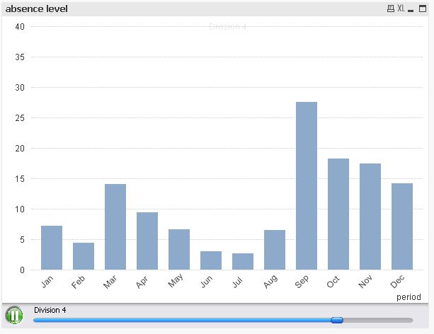
I would like to create a dashboard which has a main chart which is broken down into Divisions.
What I would like to do is show the chart based on different selections for 10 seconds rotating.
The chart shows absence levels over a period of time. I want to show the same chart like an animated presentation so that it changes every 10 seconds to show each division in turn.
e.g. Division 1 absence displayed between 0-10 seconds, Division 2 displayed between 11-20 seconds, Division 2 displayed between 21-30 seconds, then loops back to Division 1, etc.
Is this possible?
Many thanks in advance
Phil
- Mark as New
- Bookmark
- Subscribe
- Mute
- Subscribe to RSS Feed
- Permalink
- Report Inappropriate Content
Attached should give you an idea. Changing the color of the slices for every 10 seconds in the color tab. However this may consume lot of resources as Now() function is used.
Regards,
KKR
- Mark as New
- Bookmark
- Subscribe
- Mute
- Subscribe to RSS Feed
- Permalink
- Report Inappropriate Content
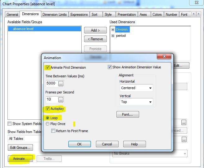
use the chart animation function.
- Mark as New
- Bookmark
- Subscribe
- Mute
- Subscribe to RSS Feed
- Permalink
- Report Inappropriate Content
hope this helps
regards
Marco